• Work
  • SHOP
  • BLOG
  • About
  • Read Me
Menu

PO HUNG

  • Work
  • SHOP
  • BLOG
  • About
  • Read Me
1379649_1344183418940891_639610307745457447_n.jpg

Brand for impoving lives 改善生活的品牌

March 18, 2016

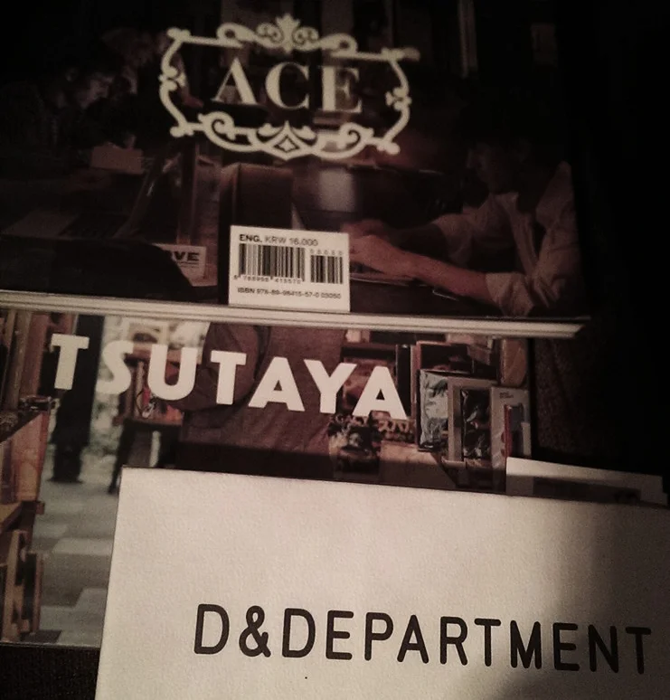
Through to read the book of "d & department project", I got the deeper understanding of their brand concept.

Nowadays, the brand idea is very important for all companies, the brand value even bigger than the product itself, we understand that it's the trend. The brand idea of d & department project is promote the good products that produced in Japan. The definition of "good product" is which must be timeless, useful, and even can use for many years with our whole lives. 長岡賢明 (the founder of d & department project) aims to promote that thinking through every touching points, e.g. the activities, staffs in the shop to deliver that theosophy, aim's to let people understand what is the Immortality design. That also help the traditional craftsman and even the young creative designer keep creating quality design and product, he believes that can improve the quality of lives in the future.

As well as Tsutaya, Ace hotel those very forward-looking brands, since the establishment of the developments, they change of the whole community's lifestyle, looking for to see more and more that kind of brands be create in the world.


透過閱讀d & department project的專書,對這品牌的理念有了更深入的了解。

推廣想法多以令物品本身的價值提升是成就一個好品牌的必然趨勢,長岡賢明的理想希望把全國不同地區美好的本土產品永續不滅地延續生產,幫助他們免被流行的洪流吞噬。真正的好產品是可以用一生的,而創作者也可以持續生產,d & department project致力於提倡和推廣全國優秀產物品的美好和實用,希望老店和傳統物品甚至有好想法好設計的年輕人有空間被推廣,令好物的生產業能生生不息。透過這店,以過各式活動,店員客戶交流,不同接觸點對永續及環保來傳遞他們的想法,是一門理想多於攢錢的生意,看完他們的想法後對品牌的思考獲益良多。而我們身邊實在出現過多生命短暫的產品在生產著。

就像tsutaya, ace hotel 這種極具前瞻性的品牌,建立後足以改變整個社區的發展,世界有多些這樣的品牌出現會美好很多。

(Figure 1 - from left: Olivier Debie for a Beigian theater, the Tokyo 2020 Organizing Committee and emblems created by Spain's Hey Studio)

(Figure 1 - from left: Olivier Debie for a Beigian theater, the Tokyo 2020 Organizing Committee and emblems created by Spain's Hey Studio)

Forward or backwards? 進步或倒退?

February 21, 2016

The Summer Olympic Games is a huge and important quadrennial event in the world, and a successful one can have an enormous impact on the host countries, influencing its status, economy and even people’s livelihoods.

Recently the long-awaited 2020 Tokyo Olympics logo design was revealed, withreviews and comments appearing on the internet soon after from all over the globe. Overall the public’s evaluation was not great:

“Are you kidding me? I’m guessing that it’s just a teaser logo.”

“It’s a weird solution, not because of the graphic theme chosen, but because of the content it represents.”

A designer, Olivier Debie, even accused the Tokyo 2020 Olympic logo creator, Kenjiro Sano, of copying his work for the Belgium theatre (FIG. 1) and hopes that Japan will not carry on using it, “[I have] decided on an action to ask for the withdrawal or the change of the [Olympic] logo.”

Aside from Debie, the design has not rated well within Japan, and some locals expect a replacement. Faced with such allegations, Sano made a public response to clarify that his logo is an original design with a graphical ‘Tokyo 2020’ following the same style. (FIG. 2)

(Figure. 2)

(Figure. 2)

So far, neither the designer or olympic official’s explanations of the concept availed the general public into appreciating it.

(Figure. 3)

(Figure. 3)


1964‭ ‬VS 2020

Another popular online comment was the design’s classic retro flavour – I think this results from having a nod to the Tokyo 1964 logo design (FIG. 3): both look simple and make use of red and gold coloured geometric shapes that reflect traditional Japanese tastes.

But if we focus purely on aesthetics, we would easily agree that the 1964 design is the better of the two. The logo was created more than fifty years ago by Yusaku Kamekura and has become a classic piece of design. It depicts the idea of the sun rising from a shimmering sea; by turning the coloured olympic rings to pure gold it gives the appearance of the reflection of the sea during golden hour, which combines with the national flag of Japan to a striking effect.

The concept behind Sano’s Tokyo 2020 logo are the three T’s: Team, Tomorrow, Tokyo. With clear intentions to be positive, there are no surprises to be found here. The element of the logo’s “T” mark is simple but not unique, a better choice of typeface could have been made for “Tokyo 2020,” and when compared to the 1964 gold rings, sticking to the standard five colours seems somewhat generic. Overall the older version has much more strength in both meaning and memorability, and since its conception nothing has come close to imitating it stylistically.

LONDON 2012‭ ‬SUMMER OLYMPIC GAMES

Back in 2007, when the London 2012 Olympic logo design was released, the response surrounding it was even greater than Tokyo 2020 with the majority of the voices being highly critical:

“Terrible, look like a kids competition entry to me.”

“Maybe its just a joke, I sincerely hope it is …”

Three years have passed since the 2012 Olympic Games took place, and I think many people changed their minds over the design after seeing the success of the whole brand experience in action.

The original idea “Everyone’s Olympics” proposed by the Wolff Olins team worked – it was simple, relevant and reflects the international spirit of the games. However, at the time most of the public thought the distorted shapes making up “2012”, which represents different nations coming together, was naive. Its bold and jarring appearance, although not sophisticated in a traditional sense, certainly broke conventions of being visually related to the host country, and makes an impression whether you like it or not. (FIG. 4)

(Figure. 4)

(Figure. 4)


A few years later, a distinct ‘look’ for the visual system was created and applied to every event touchpoint. Based off a dynamic grid drawn from the lines and shards emanating from the logo, the effect was immediate and captured the electric feeling of the world’s biggest festival. The branding achieved its goal to reinvigorate the games for today’s interconnected audience and also influence future design thinking.

I look forward to seeing how the Tokyo 2020 design team will develop their own creative brand after the hum surrounding the logo fades.


夏季奧運會為四年一度的世界盛事,一屆奧運會成功的舉辦可以涉及一個國家的榮耀,經濟,甚至民生,影響可以很巨大。

最近,萬眾期待的東京2020奧運會標誌設計終於公佈了,不過從網路上讀到世界各地熾熱的評論似乎可以感覺到大眾對其評價不高:

“Are you kidding me? I’m guessing that it’s just a teaser logo.”

“It’s a weird solution, not because of the graphic theme chosen, but because of the content it represents.”

Olivier Debie, 比利時劇院標誌的設計師甚至指東京2020奧運標誌的設計師佐野研二郎(Kenjiro Sano )抄襲其設計,希望日本能停止使用(圖1):“Decided on an action to ask for the withdrawal or the change of the (Olympics) logo.”

除了Olivier Debie提出希望官方停用現在設計外,日本國內也有不少相類似的聲音。

面對如此嚴重的指控,佐野研二郎亦作出公開回應及澄清,而且展示了其創作東京2020奧運會標誌的過程。 (圖2)

不過,無論設計師及官方人仕花費多少唇舌去解畫釋,但設計得不到普遍認同是不爭的事實。

1964‭ ‬vs 2020

另一個熱門的評論是,新的奧運標誌感覺有濃厚的經典懷舊味道 ﹣ 因為其帶有1964年東京夏季奧運會標誌設計的影子 (圖3),同樣以簡潔的基本幾何組合而成,紅色及金色的運用,整體似乎傳承著簡潔的日本傳統品味。

不過如果我們細緻地去比較兩個設計,似乎很容易便可以分出高下。1964年 亀倉 雄策 ( Yusaku Kamekura )的設計已經是超過五十年的作品,但無疑地這是經得起時間考驗的經典設計。意念是一個大紅太陽從海平面升起照耀大地,設計中亦把五色環改為單純的金色,就像金光反映,其簡練有力的程度跟日本國旗一樣的成功,一目了然,完全不用解釋。

反觀佐野研二郎的新設計,意念是3T: “Team”,”tomorrow”,
“Tokyo”。是非常正面的概念,但同時亦不帶一點驚喜。再看標誌的元素:“T”標記﹣只做到簡單却不獨特,“Tokyo 2020”字體的選擇似乎有相確餘地,“五色五輪”相較沒有1964年版本的大胆屏棄。於是我們看到,組合起來就缺少了舊版本的簡練和力量,有趣的是,如此簡潔的設計五十年來我們也找不到一個跟他相類似的案子。

倫敦 2012夏季奧運會

回顧2007年時,當倫敦2012年奧運標誌發佈後的迴響或者比東京2020的評論更龐大,世界各地批評的聲音如漫天雪花飄至倫敦,滾成巨大雪球:

“Terrible, look like a kids competition entry to me.”

“Maybe its just a joke, I sincerely hope it is …”

時至今日,2012奧運已結束了三年,但相信外界現在對倫敦奧運的舉辦成績包括品牌體驗及視覺系統却普遍轉為正面。

事實上Wolff Olins 團隊提出的原有意念是非常好的:Everyone’s Olympics,跟1964年的設計一樣簡單、有力,表達體育精神一矢中的。

不過他們設計了一個普編認為是幼稚的方案:以單純的形狀組成2012,代表五湖四海,字體的選擇亦帶點活潑,雖然不是一個“成熟”的設計,但却肯定是一個突破而給大眾記住了。 (圖4)

幾年之後,一個整體的視覺系統終於出爐,跟據“大同”,“活潑”,“單純”這些母題發展成一套相對“成熟”的系統,可以說相當成功和突破傳統,相信這個案亦影響了後來的設計品味。

現在,就期待著為東京2020奧運會設計的團隊怎樣為其意念發展出創意的視覺系統。

更新:東京於2015年8月31日尷尬地公佈被迫棄用奧運會的標誌設計:「我們不能忽視,事情的發展將會帶來危機感這風險,而我們撤回(標誌)的原因是因為它不再得到公眾的支持。」總幹事東京組委會武藤敏郎發表於新聞發佈會。

← Newer Posts

Latest & Greatest

Featured
Aug 20, 2022
WITHIN 001: A visual artist working at home
Aug 20, 2022
Aug 20, 2022
Aug 20, 2022
Talking with The Kongner - Dialogue : Unearths local culture
Aug 20, 2022
Aug 20, 2022
Jul 13, 2022
received the iF Design Award 2022 for our project Hong Kong Jockey Club New Arts Power 2020-2021.
Jul 13, 2022
Jul 13, 2022
May 6, 2022
Hong Kong Jockey Club New Arts Power 2020-2021 won an iF Design Award 2022
May 6, 2022
May 6, 2022
Oct 7, 2021
向梅原真學習!
Oct 7, 2021
Oct 7, 2021
Jul 11, 2021
聽港 Listen, Hong Kong
Jul 11, 2021
Jul 11, 2021
Jun 28, 2021
聽港 Listen, Hong Kong | Po Hung Illustration Exhibition
Jun 28, 2021
Jun 28, 2021
Oct 23, 2020
2020 TAIPEI INTERNATIONAL DESIGN AWARD 台北設計獎
Oct 23, 2020
Oct 23, 2020
Oct 6, 2020
Opening of 「像我這樣的一個港故佬」Po Hung Illustration Exhibition
Oct 6, 2020
Oct 6, 2020
Oct 6, 2020
「像我這樣一個講故佬」洪文寶插畫展 Po Hung Illustration Exhibition
Oct 6, 2020
Oct 6, 2020
節錄自我近年最欣賞的新媒體:
@happykongner @thekongner 

#storykongner : 化兩城時代為色彩  洪文寶的《雙城記》故事

馬來西亞的首都吉隆坡是一個多元文化滙聚的城市。人們在當地除了能感受到馬來西亞本地的文化之外,更不難在這個城市中見到有不少受香港文化影響的地方。在香港土生土長的插畫家洪文寶 @po_hung_art 數年前與吉隆坡這個有趣的城市結下不解緣,並從這個城市的人、事及景色中找到創作的靈感,嘗試透過作品將吉隆坡與伴隨著他成長的深水埗社區連結,即
節錄自我近年最欣賞的新媒體: @happykongner @thekongner #storykongner : 化兩城時代為色彩 洪文寶的《雙城記》故事 馬來西亞的首都吉隆坡是一個多元文化滙聚的城市。人們在當地除了能感受到馬來西亞本地的文化之外,更不難在這個城市中見到有不少受香港文化影響的地方。在香港土生土長的插畫家洪文寶 @po_hung_art 數年前與吉隆坡這個有趣的城市結下不解緣,並從這個城市的人、事及景色中找到創作的靈感,嘗試透過作品將吉隆坡與伴隨著他成長的深水埗社區連結,即日起在 @hotel_stage 地庫 The Muse 柋的《雙城記》插畫展中展出,向大家分享在他眼中兩個城市的特色。這次,我們找來了阿寶並與他談論了有關《雙城記》背後的故事與想法。 「其實我曾經有一段時間係唔中意香港人。因為我覺得香港人都好自私同無禮貌。」 在問及阿寶關於他如何開始將社區定為創作主題的時候他回應道,並緊接著說︰ 「但自從社會運動嗰段時間,香港人之間嘅連繫令我改觀。再加上喺我畫返插畫之後認識咗綠葉劇團嘅藝術總監阿達,同佢一齊做咗個社區 Project。我當時做嘅嘢就係用工筆畫嘅畫風畫出一啲香港消失緊嘅職業。喺過程之中,我接觸同認識到好多喺唔同社區入面,代表緊各種香港文化嘅職人,令我感受到原來香港人係可以有社區連繫嘅。」 就是這樣,阿寶的創作自此便跟「社區」結下了不解之緣。阿寶以畫作描繪出他心目中的香港社區的同時,會在不同地方進行展覽,所以就有了如去年於深水埗 A Little Something 舉辦的《浪蕩時光》展覽,使他能與社區分享他的創作。阿寶獨特的創作風格除了能引起本地的交流之外,更吸引了一眾熱愛香港文化的馬來西亞文化人的注意,使阿寶得到了到吉隆坡交流的機會。問及如何構思出這次與馬來西亞聯繫的展覽《雙城記》時,阿寶則說︰ 「我喺當地認識咗一個叫 ASPACE 嘅藝術團體,佢哋三位 Co- founder,Juan﹑Kenji 同 William 都係當地好勁嘅 Artist 或者 Designer。Kenji 係一個喺馬來西亞好出名嘅 Graffiti Artist,佢同我講話佢當年讀設計都係因為 Michael Lau。另外 William 又有同我講佢嘅偶像係 Juno。佢哋簡直係中意香港文化中意到入晒血。」 與 ASPACE 的朋友們的認識使阿寶驚覺原來馬來西亞有不少人都深受香港文化的薰陶。而有了香港文化作為雙方溝通橋樑,使阿寶與馬來西亞的朋友一拍即合,更使他得到了在當地辦展覽的機會。說到為何《雙城記》分別在兩地展出時,阿寶則表示︰ 「《雙城記》顧名思義就係講兩個城市 — 吉隆坡同深水埗。首先,我係想喺當地介紹返香港嘢,所以展覽嘅一部分,我直接咁將以前嘅作品擺返出嚟,然後又做啲新作品,想做一個兩地嘅對照。」 說到如何從馬來西亞的街景中找出靈感,阿寶便說︰ 「六年前,我識咗喺嗰邊嘅 Partner ,然後我哋喺當地夾咗個 Studio 叫 Putticoop,所以就多咗飛嗰邊。佢會帶我去一啲比較 Insider 嘅地方。我見到當地有一啲地方嘅街景嘅時候就覺得嗰啲地方好親切,因為好似停留咗喺 70 年代嘅香港咁樣。譬如有個地方係一個街邊嘅雲吞麵檔,呢個同我以前住喺大窩口嘅時候見到嘅環境有啲相似。又有啲地方畀我嘅感覺係好似《阿飛正傳》入面嘅場景咁,加上當地有唔少人講廣東話,所以覺得好多嘢都好似好熟悉。」 而說到兩地街景的相似,阿寶則意猶未盡的續說︰ 「我將吉隆坡嘅街頭美食畫出嚟,其實同深水埗嘅大排檔都好似。同埋又好似深水埗嘅黃金商場前身係黃金戲院,而吉隆坡又有一個地方叫 REXKL,前身係叫柏屏戲院,我又覺得有共通點所以就想做一個對照。」 面對似曾相識的街景,啟發了阿寶將吉隆坡那些具香港文化特色的景物畫成插畫,再與他所繪畫的香港景物做成對照,那便成了《雙城記》這個展覽的概念。同場更會展出紀錄阿寶多年來畫畫歷程的寫生簿供觀眾翻閱。 此外,關於《雙城記》的名字由來還有一個意思。阿寶將《雙城記》的英文名字定為《Omi Cities》,問及這個名字的意思時,阿寶表示 Omi 解作 Ominous,有一種看不到未來的意思,他指出︰ 「我發現馬來西亞同香港兩地嘅人都面對緊好多相似嘅社會﹑政治及民生問題。就好似馬來西亞過去嘅政府都做得唔好,出現好似貪污咁嘅管治問題,令到經濟同民生都好差,好多市民不滿。所以當年都引發咗一場『黃衫遊行』,好多人走上街頭。」 與此同時,阿寶亦道出在文化層面上,兩地其實在近年都正面對著相似的困境,說︰ 「除咗因為以前馬來西亞都畀英國管治過之外,佢哋以前有好多嘢都係受香港文化影響。但係近年香港文化對當地嘅影響力都開始減弱,除咗見到當地都流行緊 K-Pop 之外,取而代之嘅係多咗好多人講普通話,玩 Tiktok,某程度上人哋做呢啲嘢都幾成功。」 正因為兩地有著各方面的相似,才使阿寶萌生出了將展覽帶來香港的念頭。他希望藉著對照的形式,引起觀眾對兩地處境的關注。然而,阿寶補充說他並非因為對這種情況感到悲觀而舉辦這個展覽。 「因為我始終相信我喺咁多年嘅生活入面搵到嘅人情味。」阿寶微笑地說著。 ✍🏼@madmanhoi 📷@matthew.theclicker
It’s my honour to collaborate with my Favourite stationery brand @anatomy_co from Malaysia. It’s awesome to see my artwork on this wonderful notebook! Many thanks for the ana tomy team! :)

@anatomy_co 
@thealphabetpress 

#notebookart 
#
It’s my honour to collaborate with my Favourite stationery brand @anatomy_co from Malaysia. It’s awesome to see my artwork on this wonderful notebook! Many thanks for the ana tomy team! :) @anatomy_co @thealphabetpress #notebookart #malaysiastationery #malaysiabrand #hongkongillustration #hongkongart #anatomy #pohungdesignlab #pohung
Key Visual Design for 
MUSIC FOR 9 
A media art exhibition by @madebygaybird 
Presented by @machineartnow 

#keybisualdesign 
#mediaartexhibition 
#hongkongdesign 
#hongkongart
Key Visual Design for MUSIC FOR 9 A media art exhibition by @madebygaybird Presented by @machineartnow #keybisualdesign #mediaartexhibition #hongkongdesign #hongkongart
Hung Man Po's solo exhibition at The Stage Hotel, entitled Omi Cities. 

Exhibition duration : 
23.06 - 22.07.2023

Opening hours are : 
Monday-Saturday: 12 pm - 6pm
(Close on Sundays and Public Holidays)

The venue is:
The Muse | Hotel Stage
Basemen
Hung Man Po's solo exhibition at The Stage Hotel, entitled Omi Cities. Exhibition duration : 23.06 - 22.07.2023 Opening hours are : Monday-Saturday: 12 pm - 6pm (Close on Sundays and Public Holidays) The venue is: The Muse | Hotel Stage Basement, 1 Chi Wo Street, Jordon, Kowloon Photography: @matthew.theclicker @thekongner @happykongner #omicitieshongkong #雙城記香港 #hongkongillustration #香港插畫
文字節錄自
@beinghongkong 

念舊之外,為香港這個城市留下記錄,還有什麼意義?

霓虹燈牌、手寫招牌、老店、戰前唐樓……甚至是每天乘搭的交通工具都一直在拆卸或更迭,每次傳出結業、拆卸或重建的消息時,總會掀起短暫的懷舊熱潮,吸引不少市民到訪留影。而當攝影師、藝術家或收藏家在各自的領域為昔日風貌留下一份記錄時,也難免會被扣上眷戀舊物、消費情懷的標籤,背後的心思及作品帶來的思考,也可能會被忽略。

「香港是一個密集發展的地方,經常會看到整路和很多地盤,變化得
文字節錄自 @beinghongkong 念舊之外,為香港這個城市留下記錄,還有什麼意義? 霓虹燈牌、手寫招牌、老店、戰前唐樓……甚至是每天乘搭的交通工具都一直在拆卸或更迭,每次傳出結業、拆卸或重建的消息時,總會掀起短暫的懷舊熱潮,吸引不少市民到訪留影。而當攝影師、藝術家或收藏家在各自的領域為昔日風貌留下一份記錄時,也難免會被扣上眷戀舊物、消費情懷的標籤,背後的心思及作品帶來的思考,也可能會被忽略。 「香港是一個密集發展的地方,經常會看到整路和很多地盤,變化得很快——即使只是隔了一兩年也會有很多改變,而在當中生活的我們也會受環境變化的影響。」 以黑白風格繪畫香港景物,嘗試結合故事呈現景物的本地畫家 @penso ,坦言沒有刻意要繪畫舊風貌,更多的是記錄自己生活日常當下所見的景物建築,如小時候生活的油尖旺區、新填地街,個人很喜歡的深水埗、曾每日往來工作室的新蒲崗等,只是往往畫完一個地方,不久後總會迎來地方即將遷拆的消息,或者見證其逐漸被改變。 「以前的人常說『借古鑒今』,所以我們在念舊之外,其實也要思考現在和未來,不能只留戀過去。例如珍寶海鮮舫離開,很多人會關注會影相,但其實還要思考下次類似情況可以怎樣保留怎樣做。就像我的故事(《回憶見》)的結局,其實也是想帶出同一個道理。之前我曾想過自己若要突破,就不要繼續畫香港元素;但後來發現原來可以繼續繪畫記錄香港景物,同時思考能否用另一種形式去帶來更多不同。」 換另一種形式去「記錄香港」,對於另一位本地畫家 @po_hung_art而言,則不一定侷限在香港元素上,有時候透過比較兩個城市之間的異同,也能讓人更了解自身城市的文化特色。Po Hung的《雙城記》展覽除了把香港的景色帶到吉隆坡,亦嘗試把吉隆坡的景色帶到香港。「我選取了一些兩個城市的特色元素去作對比,例如用吉隆坡的茨廠街去對比香港深水埗街頭,或者用當地的茶樓、街頭小販等,與香港對照。」 「馬來西亞是一個非常能感受到香港文化輸出的地方,近來先後去了兩次書展和展覽,有很多喜歡香港、熟悉香港的人會過來,告訴我他們都是看著香港電影長大。很多人以為香港文化輸出只是停留在輝煌的八九十年代,但在馬來西亞時,卻發現他們無論新舊歌手都能認出,反過來也讓我們重新發掘和感受到香港近年的文化風氣。」 @penso 《回憶見》漫畫體驗展 日期:即日起至7月7日(逢星期一、二休息) 時間:早上10時至晚上7時 地點:西營盤第二街2A @ztoryteller.gallery @po_hung_art《雙城記》展覽 日期:即日起至7月22日(逢星期日及公眾假期休息) 時間:中午12時至晚上6時 地點:佐敦志和街1號登臺酒店地庫 #香港展覽 #香港畫家 #香港文化 #舊香港 #老店 #舊建築
Hung Man Po's solo exhibition at The Stage Hotel, entitled Omi Cities. 

Exhibition duration : 
23.06 - 22.07.2023

Opening hours are : 
Monday-Wednesday: 12 pm - 6 pm
Thursday-Saturday: 12 pm - 11 pm
(Close on Sundays and Public Holidays)

The venue
Hung Man Po's solo exhibition at The Stage Hotel, entitled Omi Cities. Exhibition duration : 23.06 - 22.07.2023 Opening hours are : Monday-Wednesday: 12 pm - 6 pm Thursday-Saturday: 12 pm - 11 pm (Close on Sundays and Public Holidays) The venue is: The Muse | Hotel Stage Basement, 1 Chi Wo Street, Jordon, Kowloon #omicitieshongkong #雙城記香港 #hongkongillustration #香港插畫
Your presence is highly appreciated at Hung Man Po's solo exhibition at The Stage Hotel, entitled Omi Cities. 

Exhibition duration : 
23.06 - 22.07.2023

Opening hours are : 
Monday-Wednesday: 12 pm - 6 pm
Thursday-Saturday: 12 pm - 11 pm
(Close on
Your presence is highly appreciated at Hung Man Po's solo exhibition at The Stage Hotel, entitled Omi Cities. Exhibition duration : 23.06 - 22.07.2023 Opening hours are : Monday-Wednesday: 12 pm - 6 pm Thursday-Saturday: 12 pm - 11 pm (Close on Sundays and Public Holidays) The Venue is: The muse | Hotel Stage Basement, 1 Chi Wo Street, Jordan, Kowloon #omicitieshongkong #雙城記香港 #illustrationexhibition #插畫展 #hongkongart #hongkongcluture
預告preview:
#雙城記-香港
#omicities-HK

Risograph printing:
@dotdotdot.hk (Hong Kong)
@inkinkder (kuala lumpur)
預告preview: #雙城記-香港 #omicities-HK Risograph printing: @dotdotdot.hk (Hong Kong) @inkinkder (kuala lumpur)
#lifedrawing 
#gauachepainting 
#hongkongart
#lifedrawing #gauachepainting #hongkongart
#lifedrawing 
#chineseinkpainting 
#hongkongart
#lifedrawing #chineseinkpainting #hongkongart

©2016