


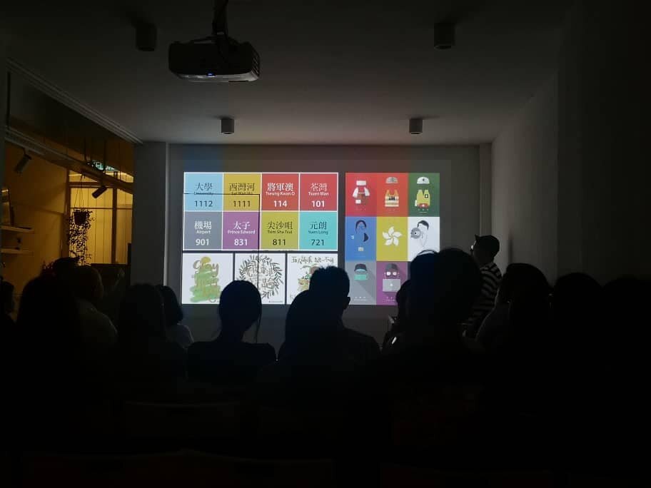
https://www.youtube.com/watch?v=UDbqPl7MrwM

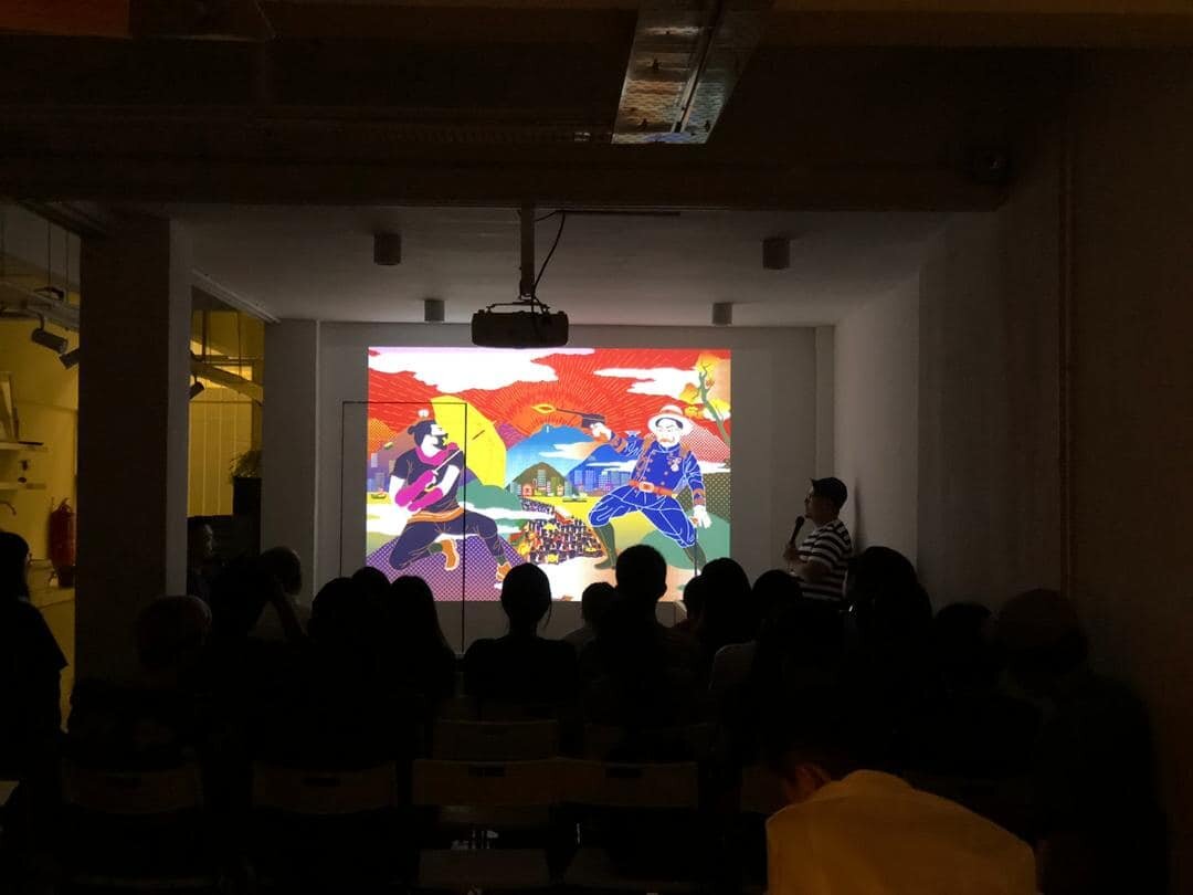
Talking with The Kongner - Dialogue : Unearths local culture
https://kongner.com/dialogues/po-hung
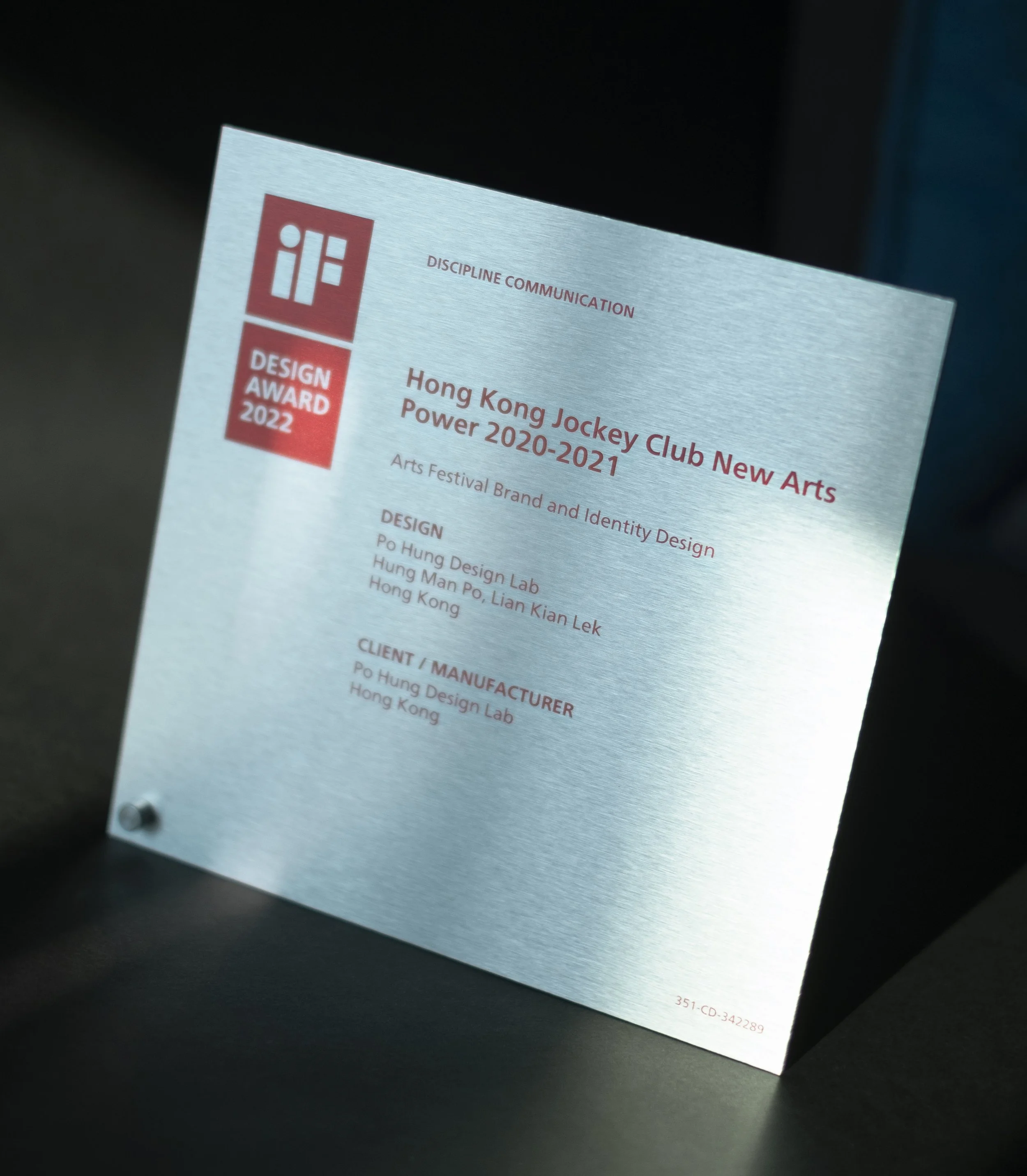
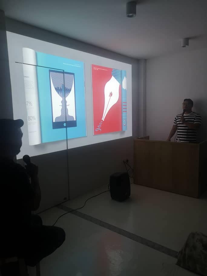
received the iF Design Award 2022 for our project Hong Kong Jockey Club New Arts Power 2020-2021.


We are thrilled to received the iF Design Award 2022 for our project Hong Kong Jockey Club New Arts Power 2020-2021.
This project is a joint effort by Po Hung Design Lab (Hong Kong) @po_hung and Putticoop @putticooperation (Kuala Lumpur) and our client Hong Kong Arts Development Council.
This year, about 11,000 projects from 57 countries participated in the iF Design Award 2022. We are honoured to be amongst the winners of this internationally renowned design award.
* This project has previously received 10th Taiwan International Graphic Design Award 2021.
榮譽宣佈 香港賽馬會藝壇新勢力 2020-2021 項目獲得 2022年 iF設計獎。
主設計公司為 Po Hung Design Lab (香港) @po_hung 和 Putticoop @putticooperation (吉隆坡)。感謝我們的客戶香港藝術發展局。
我們很榮幸在今年來自 57 個國家,約 11,000 個參賽項目裡脫穎而出,成為此國際知名的iF設計大獎的獲獎者之一。
* 此項目曾獲 2021臺灣國際平面設計獎。
https://ifdesign.com/en/winner-ranking/project/hong-kong-jockey-club-new-arts-power-2020-2021/342289
#iFDesignAward2022
#iFDesignAward
#PoHungDesignLab
#Putticoop
#HKJCNAP
#JCNAP
#NewArtsPower
#香港藝壇新勢力
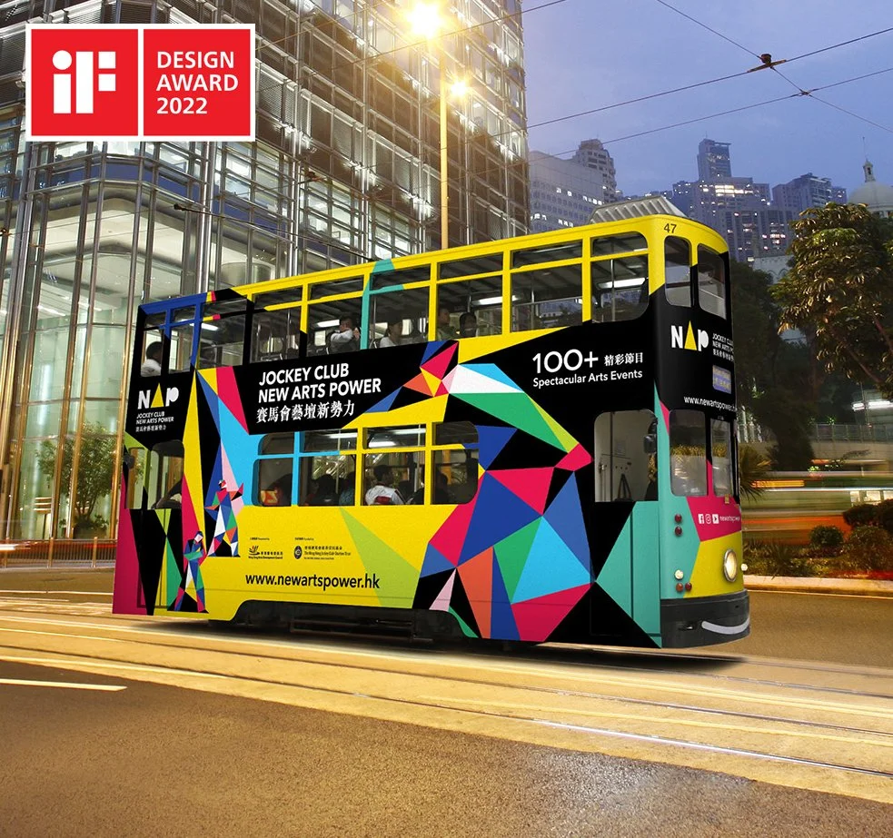
Hong Kong Jockey Club New Arts Power 2020-2021 won an iF Design Award 2022
I am glad that Hong Kong Jockey Club New Art Power 2020-2021 has won an iF Design Award 2022.
Thanks to my work partner putticoop and client HKADA..
A record number of 11,000 products and projects were registered for the iF Design Award 2022. In the first jury round, the iF Preselection, 5,426 submissions from 2,687 participants and from 57 nations were selected for the iF Final Jury.

向梅原真學習!
https://045tdw.com/2021/01/21/%e5%9c%b0%e6%96%b9%e3%82%92%e5%85%83%e6%b0%97%e3%81%ab%e3%81%99%e3%82%8b%e7%88%b6%e6%80%a7/trackback/
最近一口氣買了三本日本地方創生設計的書:重塑日本風景、設計好味道及Local Design地方設計。剛讀完首兩本梅原真編寫的,當中梅原真如何以地方產物真正價值去思考,配合自身很強「對」的直覺,再減去設計師常有的過多的Ego自我,加上梅原真的行動力,創造出獨有的設計理念,很多例子都值得我們設計師去學習。除了品牌、包裝設計再創生的例子,以下的「行動設計」也很有值得深思:
// 「移居到沉下橋附近」這個決定,對他來說是一個新的體悟,或許也可以說影響了他日後的設計觀,甚至是價值觀」。
距今約四十年前的1989年,當時日本在一片欣欣向榮的泡沫經濟時期,國家的財政也是既寬裕又大方,各種土木相關的建設改建都能分撥到大筆款項。高知縣的十和村也不例外,當時的村長把建設大橋當作自己重要的責任。
為什麼要蓋大橋?原本的橋呢?這條被稱作「日本最後的清流」的四萬十川,如果包括支流在內,一共有四十七座大雨來了就會被淹沒的「沉下橋」,梅原真說,沉下橋就是生活的橋。在沒有橋的時代,要到對岸時必須渡舟,而為了要解除這樣的不便的交通果擾,居民與地方政府共同出資蓋了這些沉下橋。
沉下橋得名是因為大雨來臨、河水上漲之後,橋面就會消失在湍急的河面中。另外,雖然是鋼筋混泥土製,但為了減少洪水來臨時的扺抗,並沒有設計欄杆,而橋的寬幅也僅有三公尺寬。正因為這樣,橋對於洪水的抵抗力低,因而成為不易捐壞、能與洪水共存的橋。只是,種種便利性、安全性的考量,都讓村長不論如何都想要拆除沉下橋,建造新的大橋。
但梅原真的想法是,橋在暴風雨的時候消失,風雨過後又若無其事的露臉,不就是四萬十川特殊的風景?另外,橋的消失正同時傳遞著敬畏自然的訊息,對人類來說彷彿是一種提醒的存在。於是,梅原真跑去找村長,向村長提議:「這座橋不是更應該要讓它繼續在那裡嗎?」但村長以「你從都市來,也不住在村裡,你沒有發言的權利」,當場回絕。
村長以及村裡的許多村民,都把沉下橋的一切看作是負面的,這讓以正面態度看待沉下橋的梅原真「非常火大」,因為他深信,如果不珍視現在所擁有的東西,只想著要追求最新的東西,這樣是行不通的。
1989年末他直接搬了去一所沉下橋的對面住了下來。「拿著標語抗爭是一種設計,而我搬到那裡去也是一種設計。如此一來,選一個比較有趣的方式不是比較好嗎?」那之後的村落會議或是活動,梅原真都不缺席。雖然一年中偶有三、四回沉下橋會因為沉進洪水中,有三天左右必須要繞道到三公里距離的上游才能渡河,但仍阻擋不了他保衛沉下橋的初衷。最後,沉下橋成功被保留下來,而當時完全想不到的是,沉下橋現在成了當地的觀光特色,每個假日都有名台遊覽車載著達道而來的遊客來看這座古老的橋。// 輯自Local Design地方設計

聽港 Listen, Hong Kong
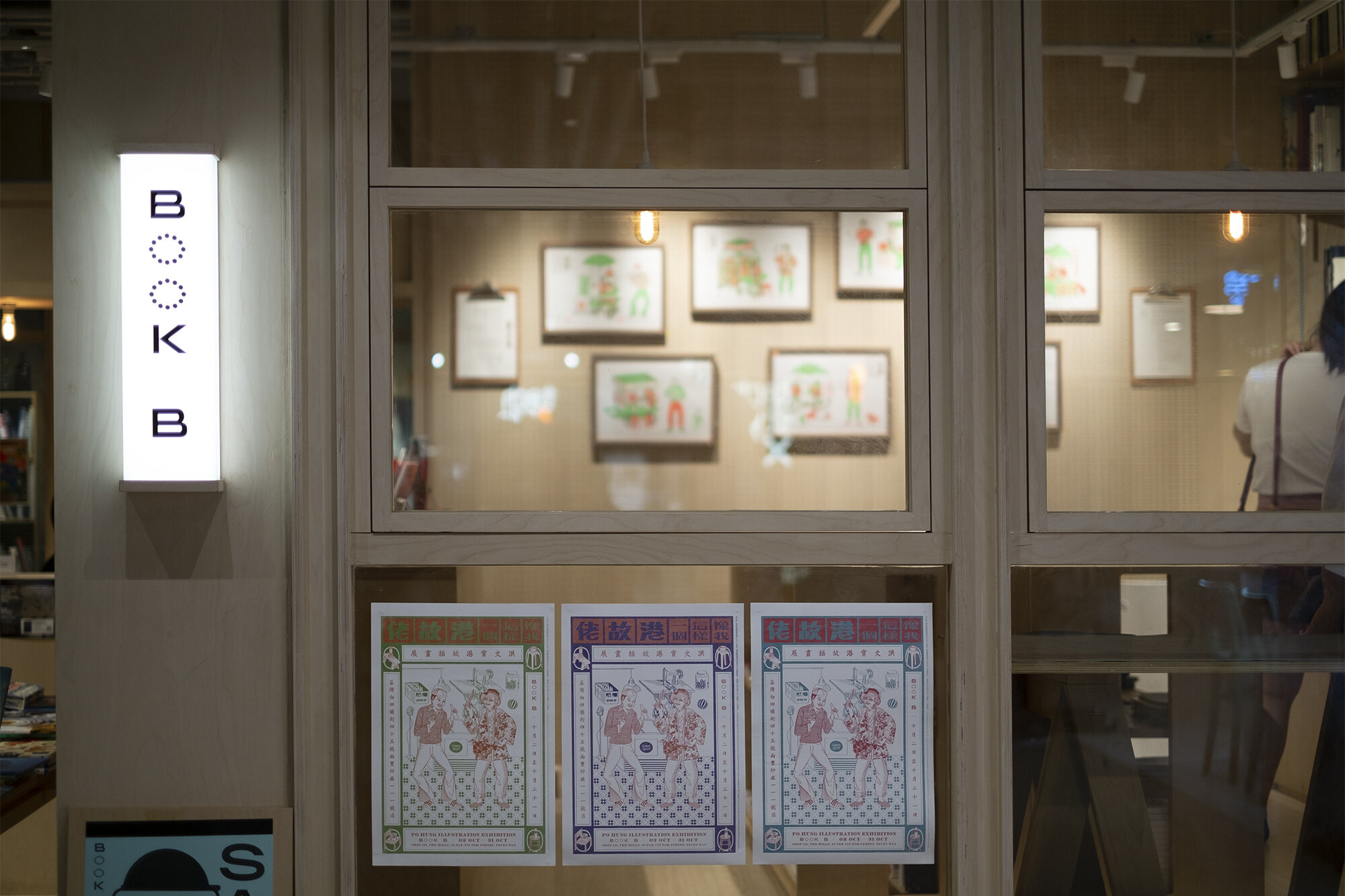
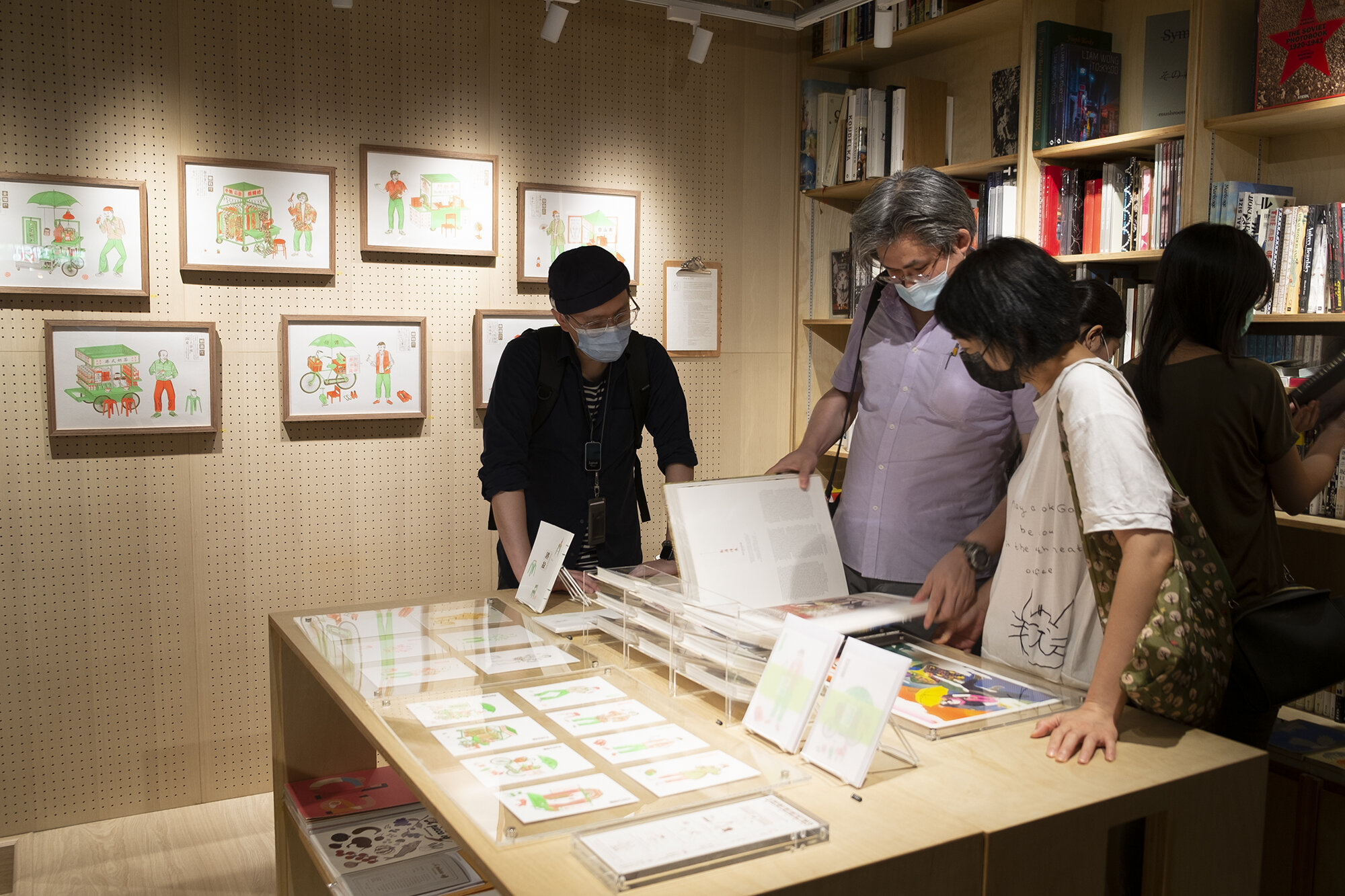
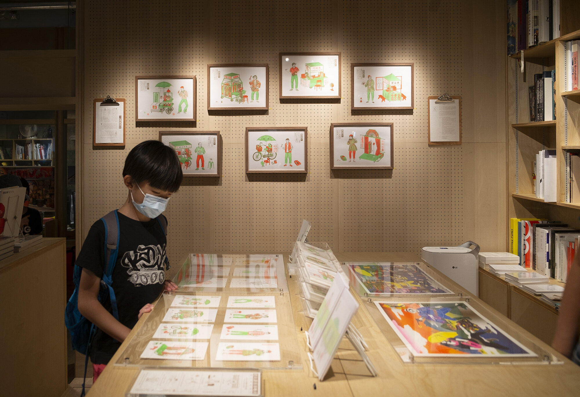
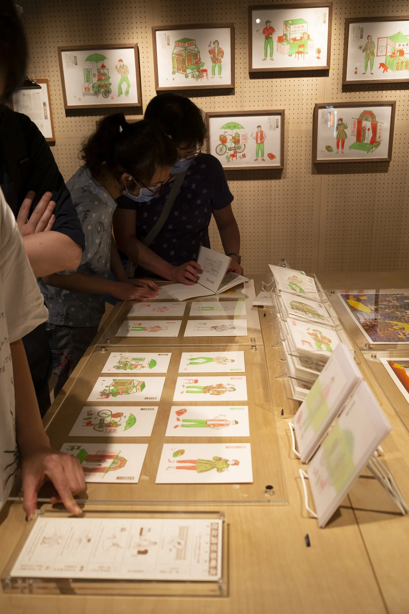
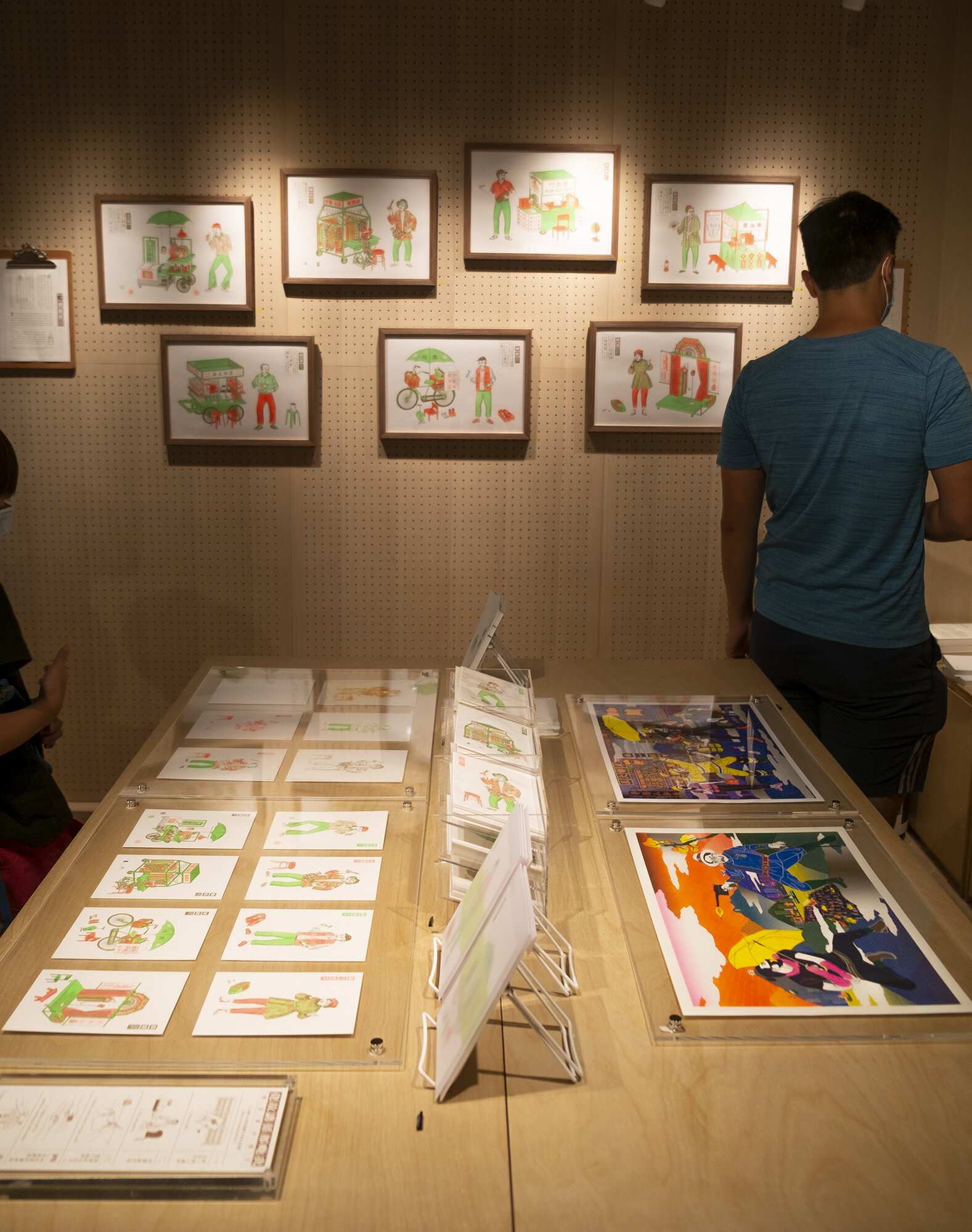
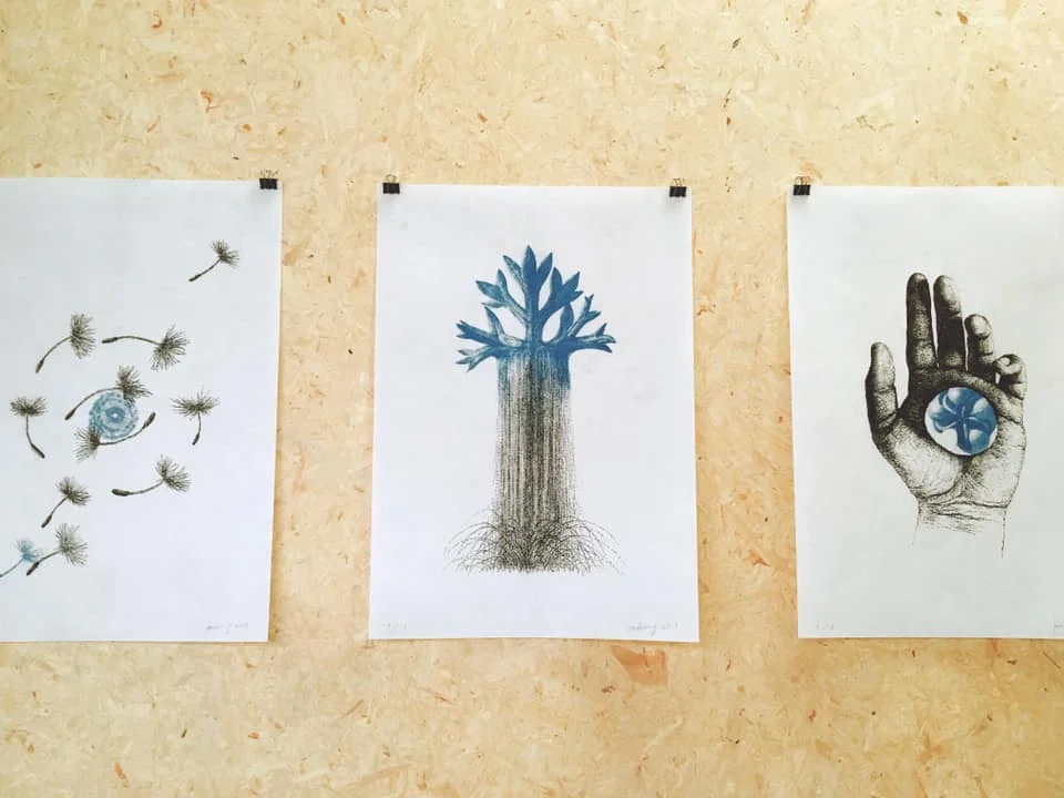
Po Hung Illustration Exhibition
09-31. 07. 2021 (CLOSED ON SUNDAY)
The Muse, Hotel Stage (12:00-22:00)
Basement, 1 Chi Wo Street, Jordan
佐敦志和街一號地庫
Po Hung X @dotdotdot.hk
----------------------------------------
過去兩年,世界受疫情影響令經濟下滑,香港無可避免受大環境衝擊,很多品牌和商店或多或少因此而相繼結業... ...
2020年底洪文寶受「being Hong Kong 就係香港」雜誌邀請,選出8個在疫情下結束的本地品牌或店舖繪畫插畫,把它們風光的一刻紀錄下來,當中包括港龍航空、Jimmy’s Kitchen、珍寶海鮮舫、辰衝書店等,當中充滿幾代人的集體回憶,希望大家透過作品,更能珍惜和支持現存的特色香港品牌。
而這次洪文寶為配合懷舊主題,再次夥拍Dotdotdot Studio以「孔版印刷Risograph Printing」—— 比較接近手工印刷的方式為作品限量制作。
「聽港」—就讓洪文寶來為您們訴說香港故事。
While Coronavirus is still raging in the world. Initially, The market consumption rate immediately dropped in Hong Kong. Some brands that are widely known to Hong Kong people disappearing quickly…
At the end of 2020, Hung Man Po was invited to collaborate with the magazine “being HK 就係香港” and selected 8 unique brands that closed during the pandemic, including Dragonair, Jimmy’s kitchen, Jumbo Seafood Boat, and Chenchong Bookstore, etc. to portray their sceneries, which are full of collective memories of different generations.
Once again, Po collaborates with local printer dotdotdot studio, using Risograph printing – similar to silkscreen printing technique to produce this limited collection of artwork.
“Listen, Hong Kong” - let Hong Man Po tells you the story of Hong Kong.


聽港 Listen, Hong Kong | Po Hung Illustration Exhibition
09-31. 07. 2021
The Muse, Hotel Stage (12:00-22:00)
Basement, 1 Chi Wo Street, Jordan
佐敦志和街一號地庫
Po Hung X @dotdotdot.hk
新武肺炎在世界仍然肆虐,過去大家長時間stage at home 或受政府防疫政策影響,市場消費率即時大減。香港經濟隨即受到震盪,一些廣為人知的品牌就悄無聲色地消失。2020年底洪文寶受「being Hong Kong 就係香港」雜誌邀請,選出8個在疫情下結束的本地品牌,當中包括港龍航空、Jimmy’s Kitchen、珍寶海鮮舫、辰衝書店等,把它們的風光景象描繪下來,當中充滿幾代人的集體回憶,以作紀錄和傳承。「聽港」—就讓洪文寶來為您們訴說香港故事。
While Coronavirus is still raging in the world. Initially, The market consumption rate immediately dropped in Hong Kong. Some brands that are widely known to Hong Kong people disappearing quickly… At the end of 2020, Hung Man Po was invited to collaborate with the magazine “being HK 就係香港” and selected 8 unique brands that closed during the pandemic, including Dragonair, Jimmy’s kitchen, Jumbo Seafood Boat, and Chenchong Bookstore, etc. to portray their sceneries, which are full of collective memories of different generations. “Listen, Hong Kong” - let Hong Man Po tells you the story of Hong Kong.
#honngculture #hongkongart #hongkongillustration #illustration #risographart #pohungdesignlab #pohungart

2020 TAIPEI INTERNATIONAL DESIGN AWARD 台北設計獎


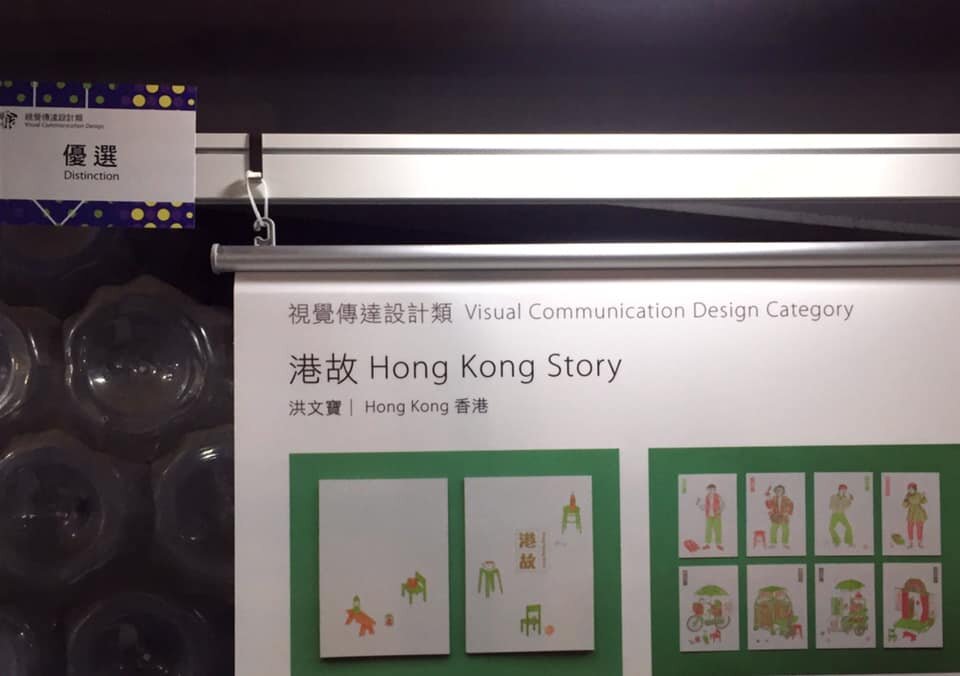
I am glad that Hong Kong Story 港故 got awarded Distinction 優選 in this year Taipei International Design Award 台北設計獎 out of 5,508 submissions from 72 countries and regions.
Thanks for all the parties and my friends who helped and involved in this project.
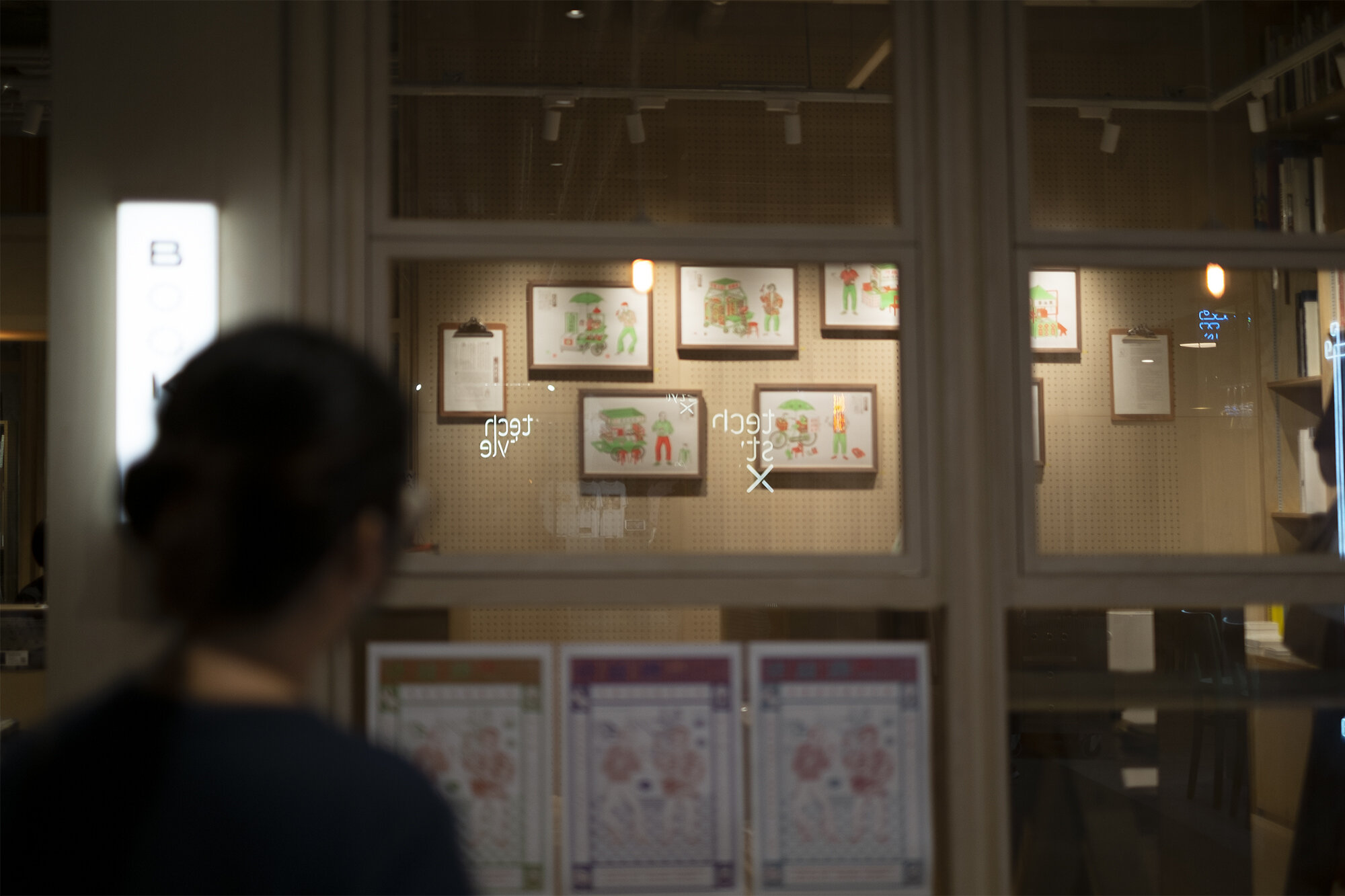
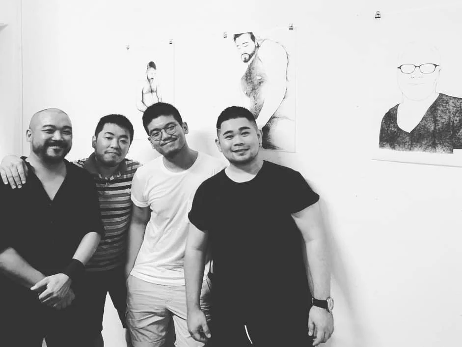
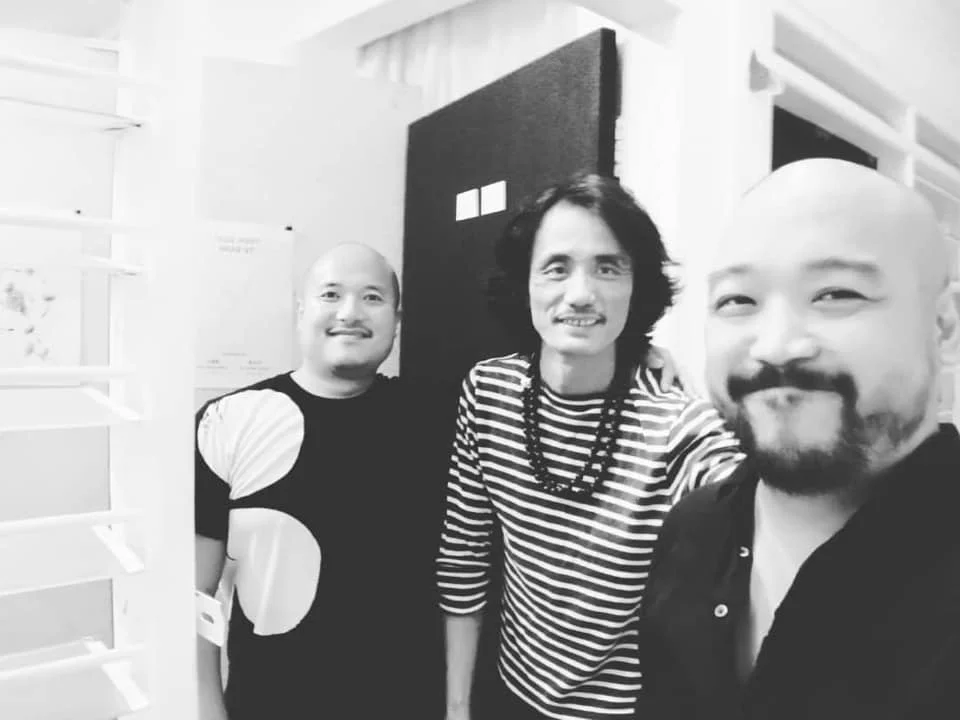
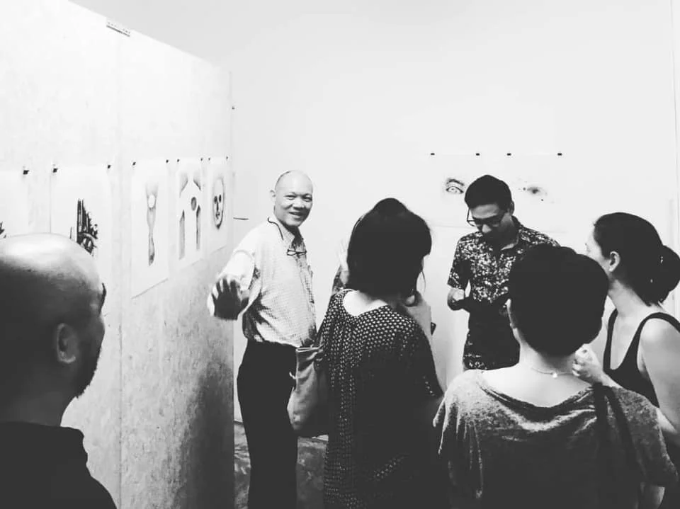
Opening of 「像我這樣的一個港故佬」Po Hung Illustration Exhibition
對於這個城市的人,一個困擾的問題是,香港,到底是什麼?對10個人來說,也許就有多於10種的看法。我們抱持著自身的信念,過著自己的生活,安靜地等待生命的結束。
去年,藝術家洪文寶詢問自己一個相同的問題:香港,到底是什麼?他不是思考和論述型的人。他實際走在香港的街道上,以身體經驗代替思辯,尋找這個問題的答案。
他的感受是,有些事物,不論是看得見的,或是看不見的,都在城市的景觀中,消失了。
他想:唯一能夠對抗遺忘的,是故事。
失去紙筆,再也不能寫小說;失去攝錄機,再也不能拍電影。但講故事的技藝,是不會消失的。只要有講故事的人,故事,就會一直流傳下去。
直至最後的最後。
▍展覽詳情
展期|即日起至31/10/2020
時間|12-7pm
地點|Book B 荃灣白田壩街45號南豐紗廠111號舖
#illustration #exhibition #bookbhk #hongkongbookstore #hongkong #JockeyClubNewArtsPower

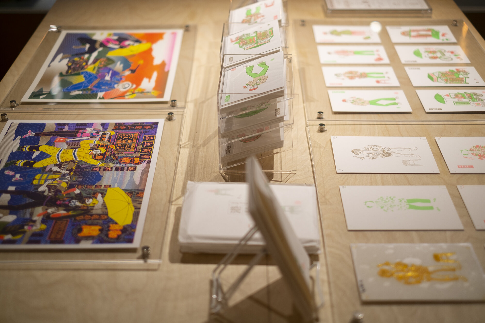
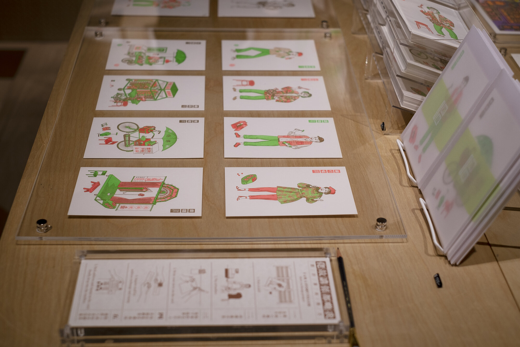
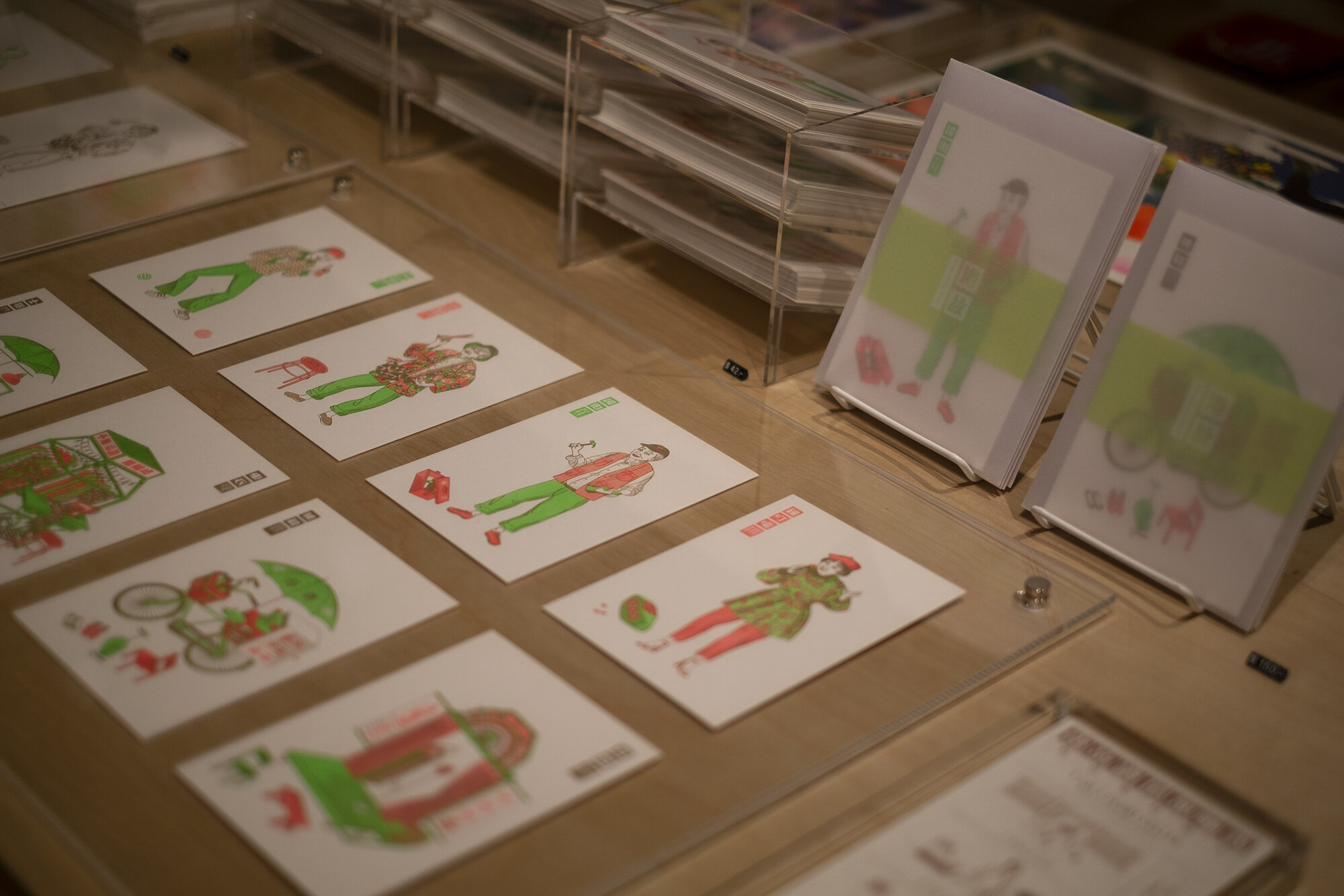
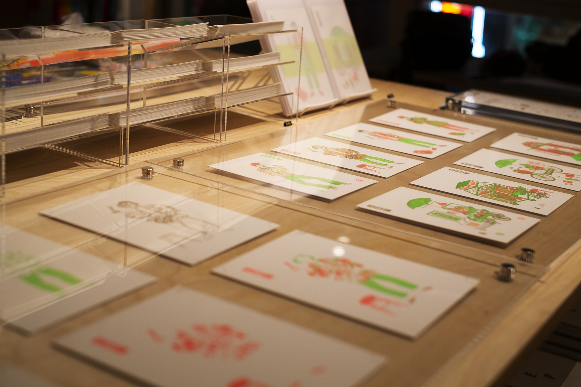
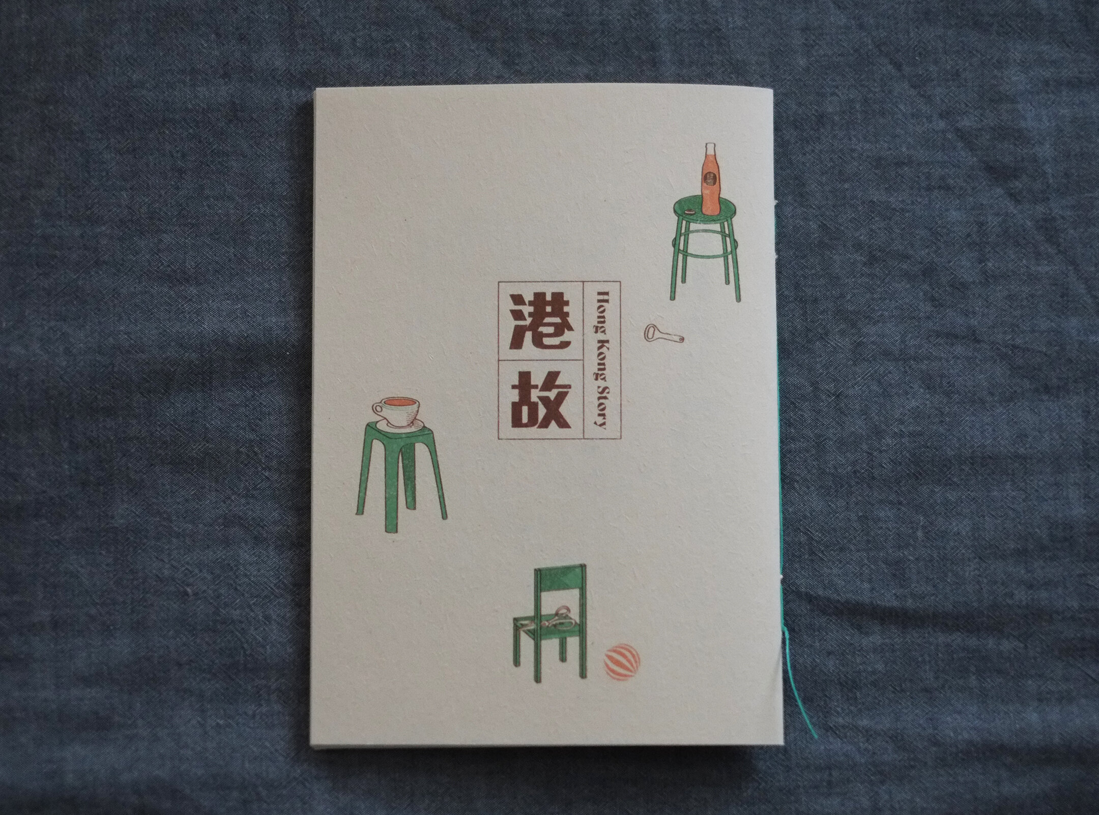
「像我這樣一個講故佬」洪文寶插畫展 Po Hung Illustration Exhibition
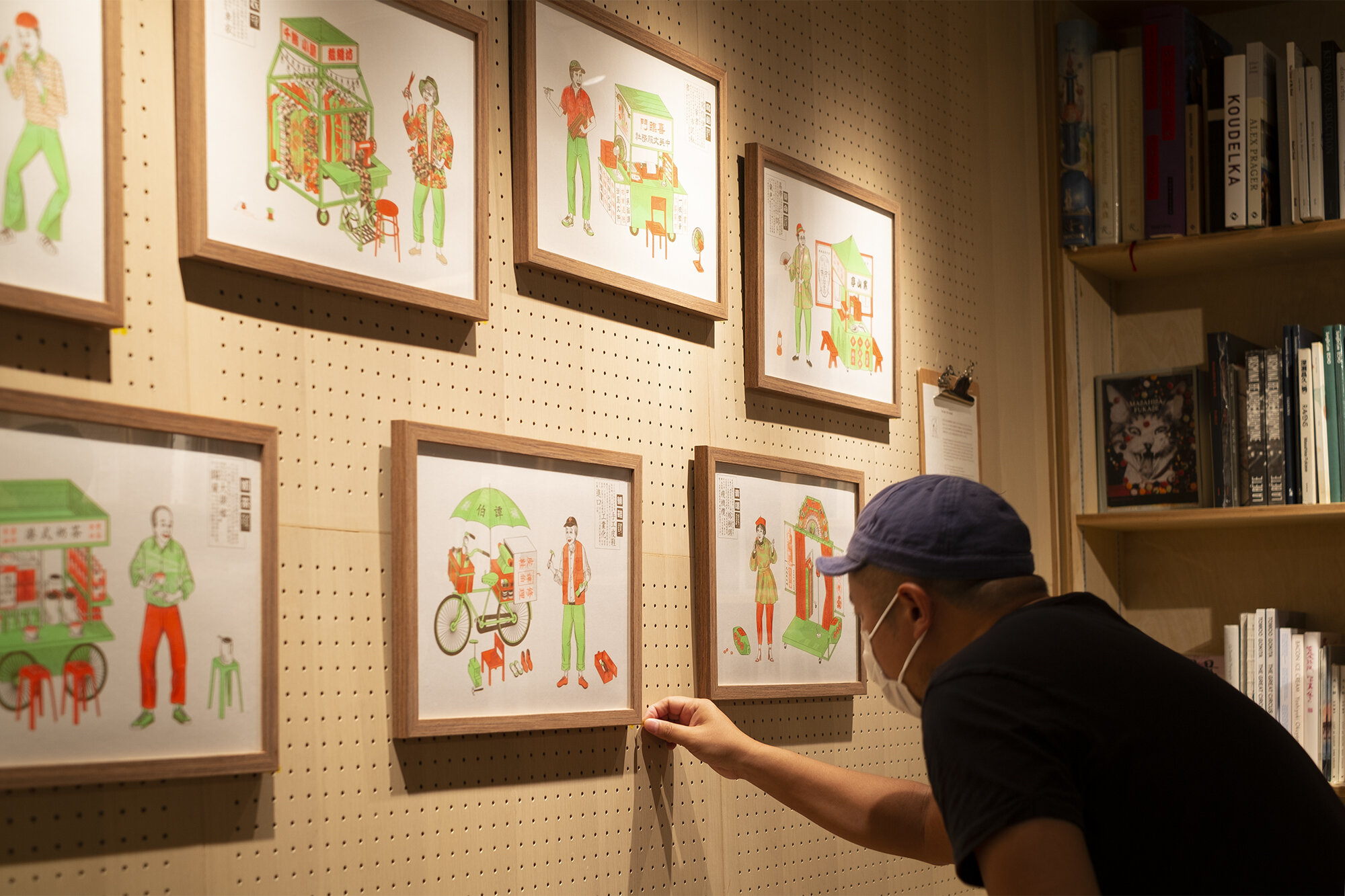
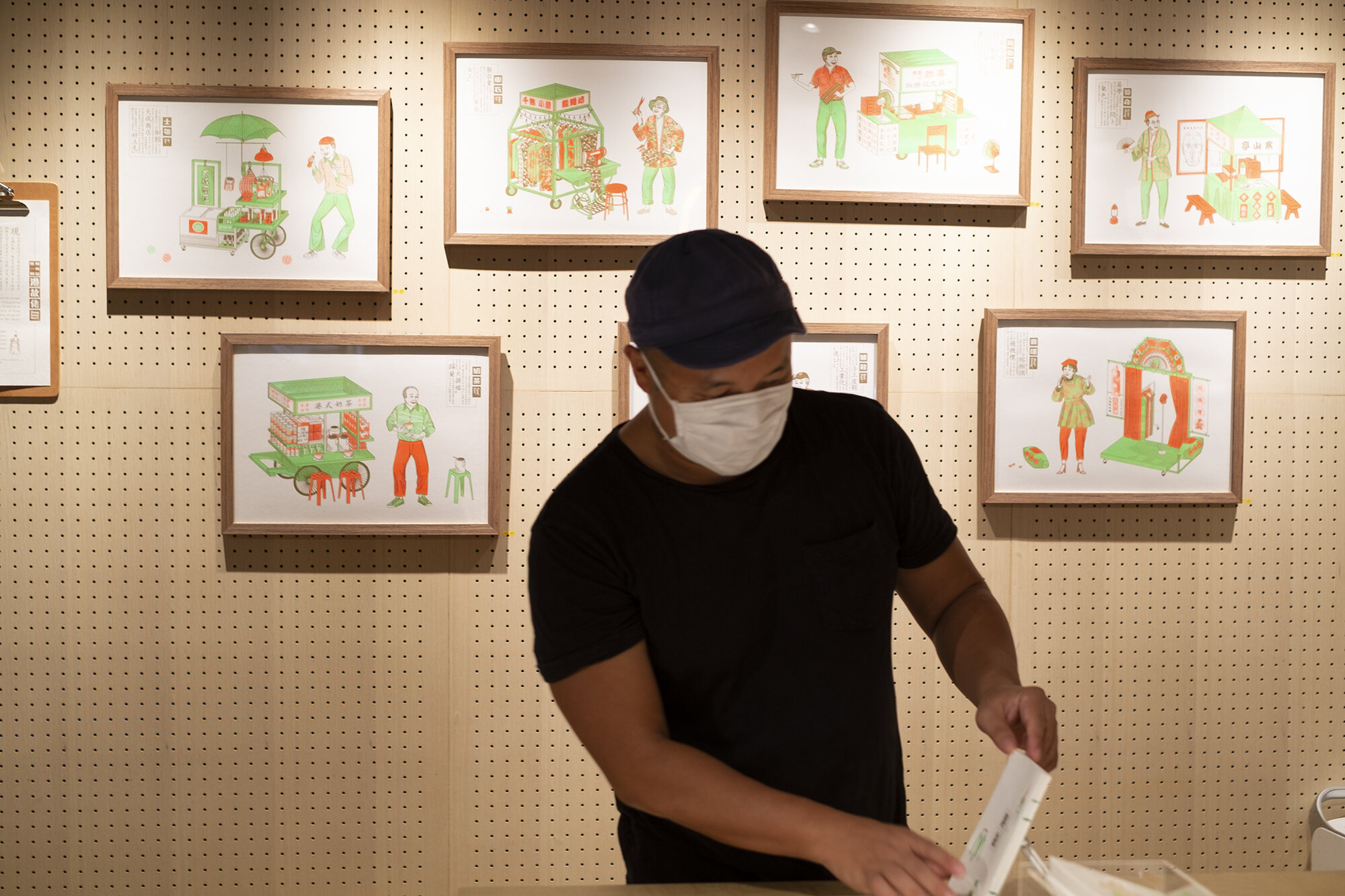
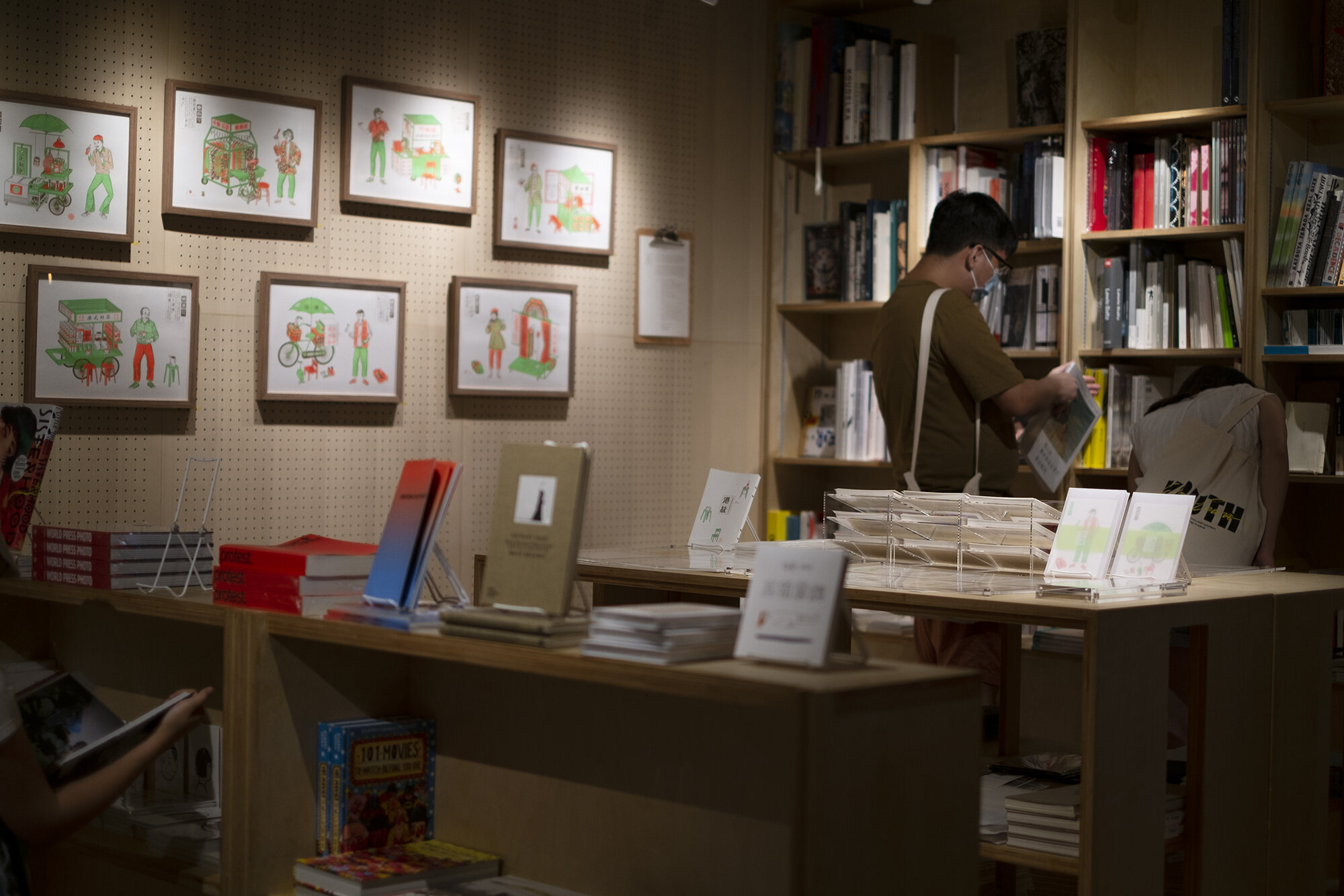
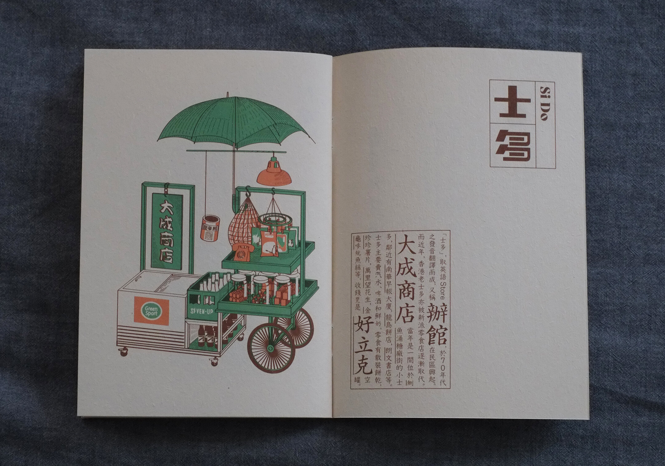
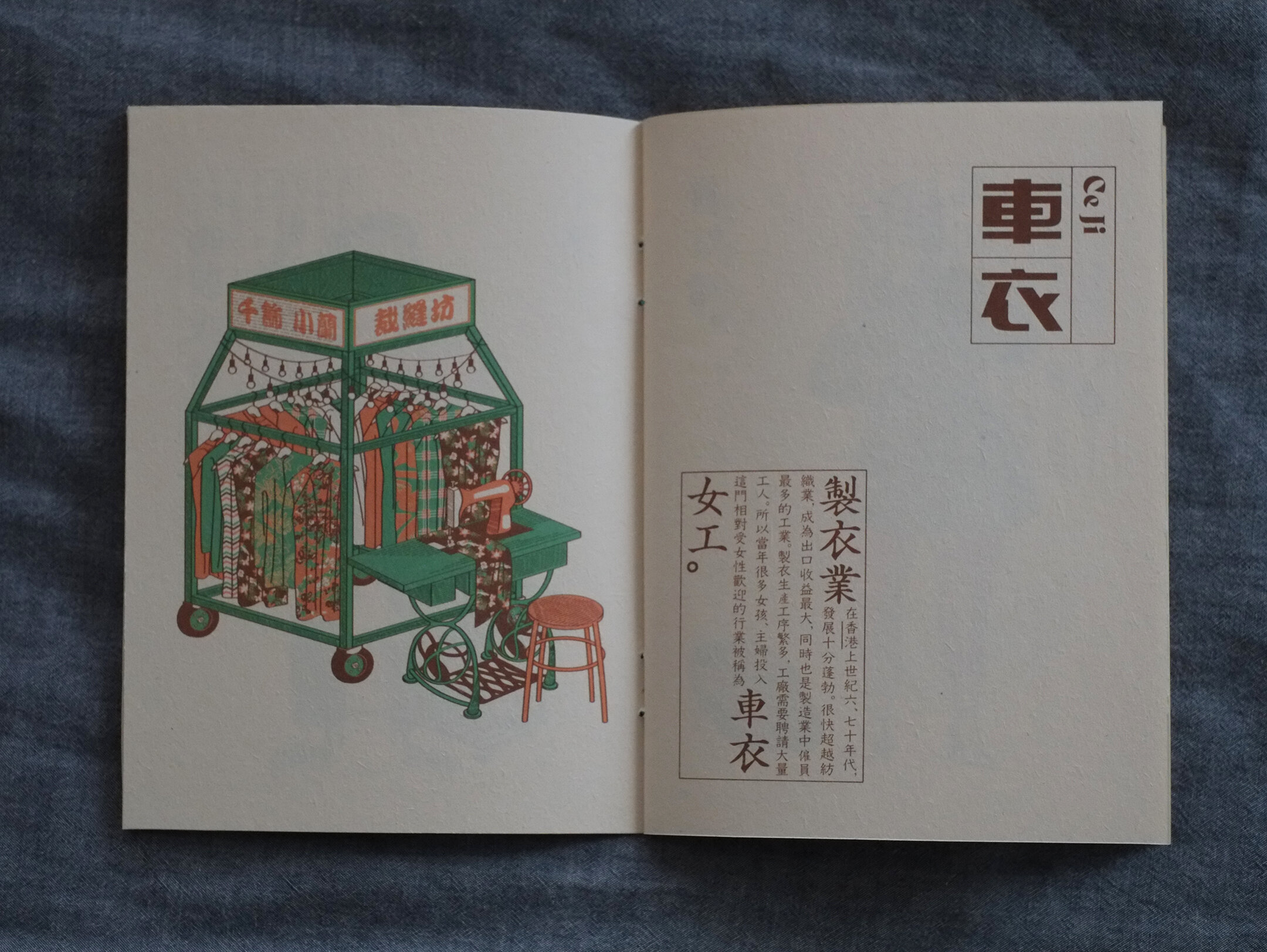
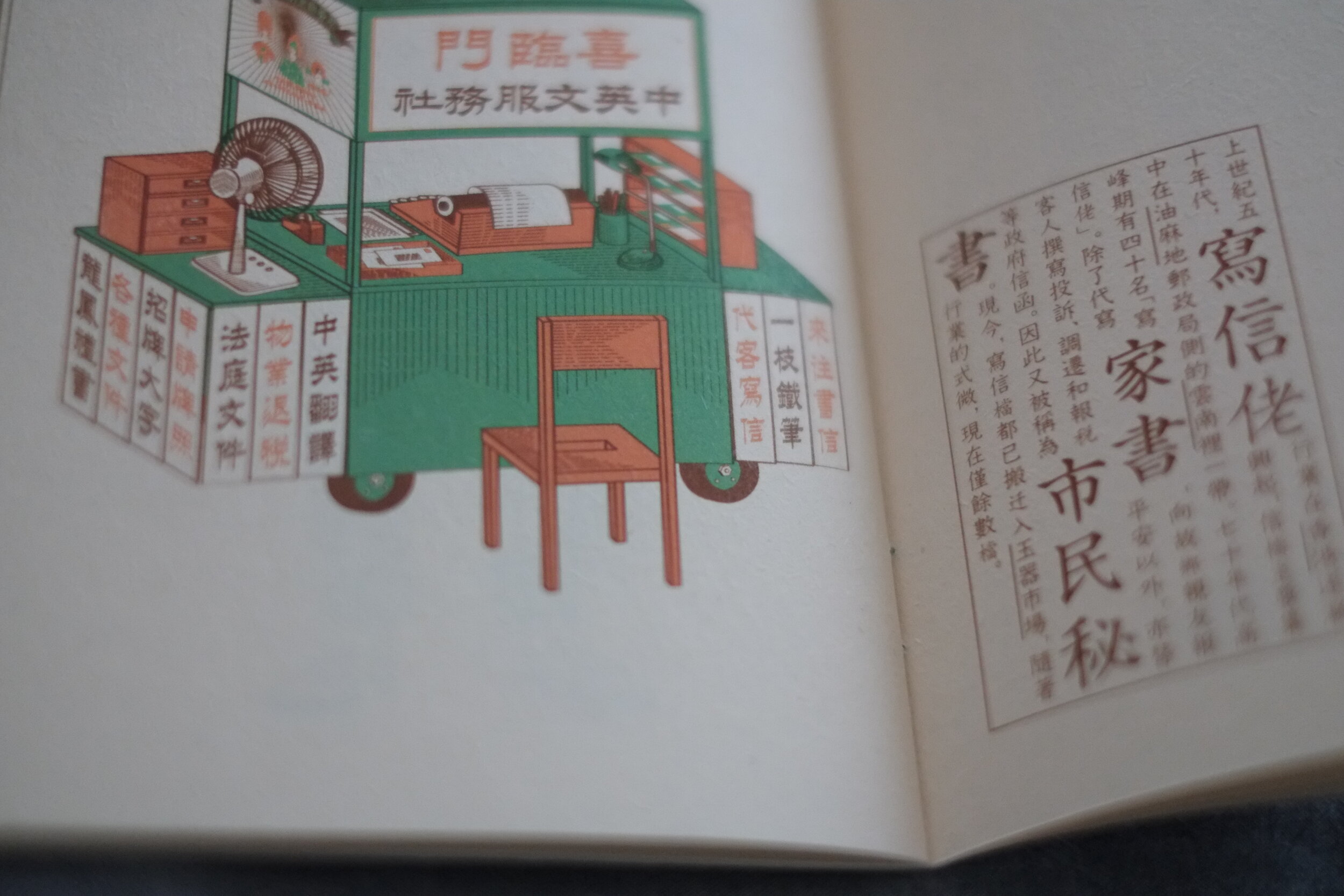
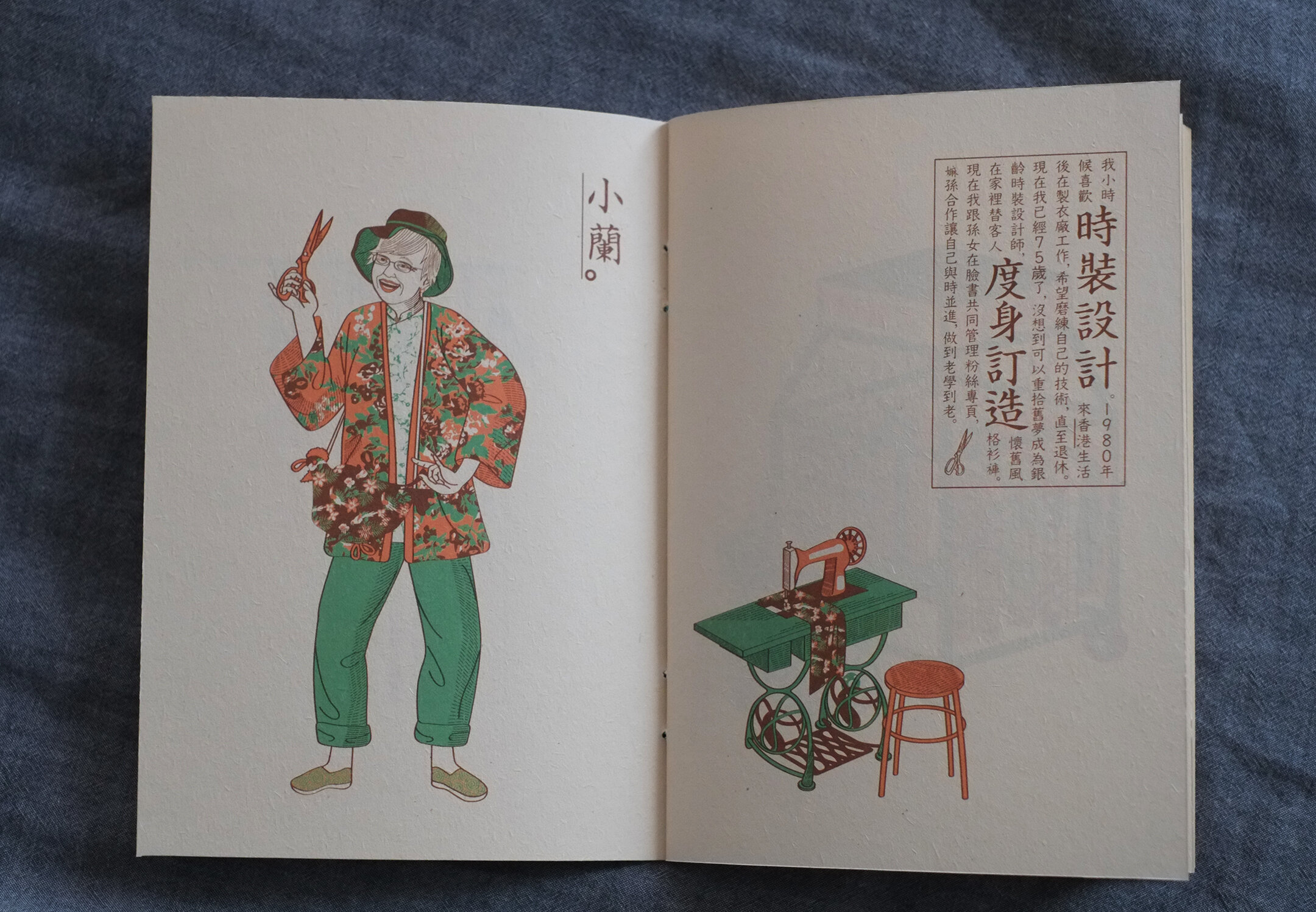
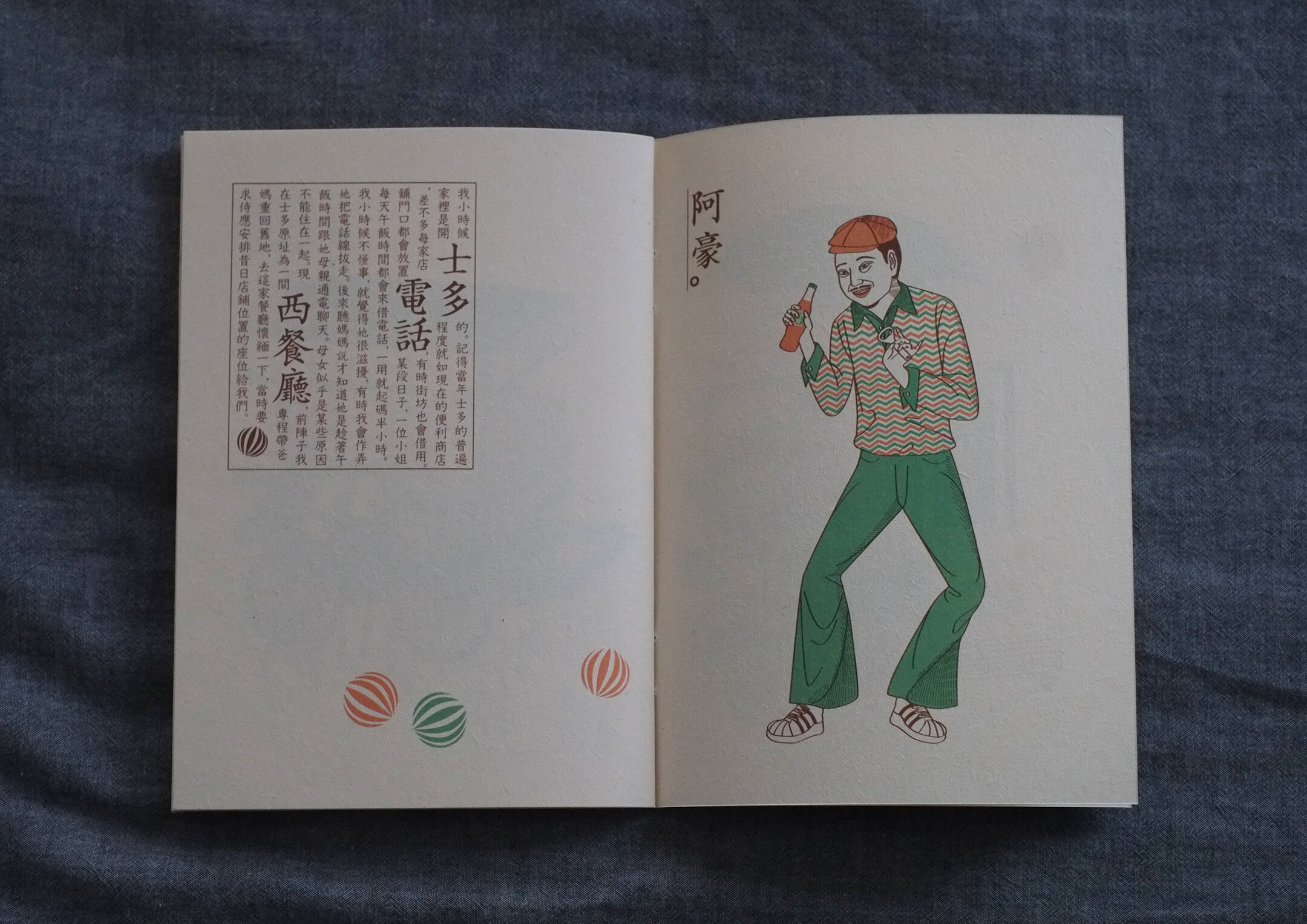
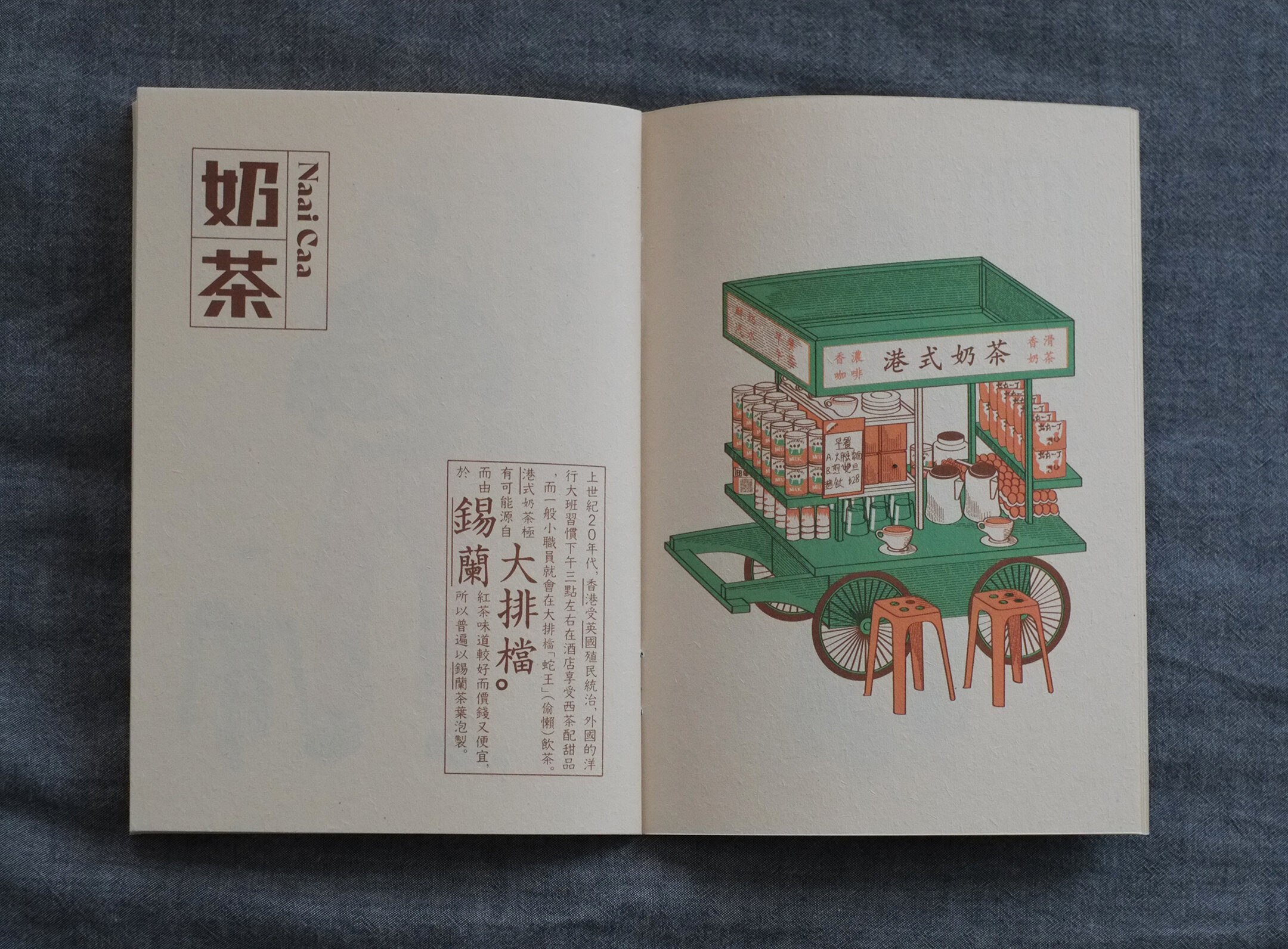
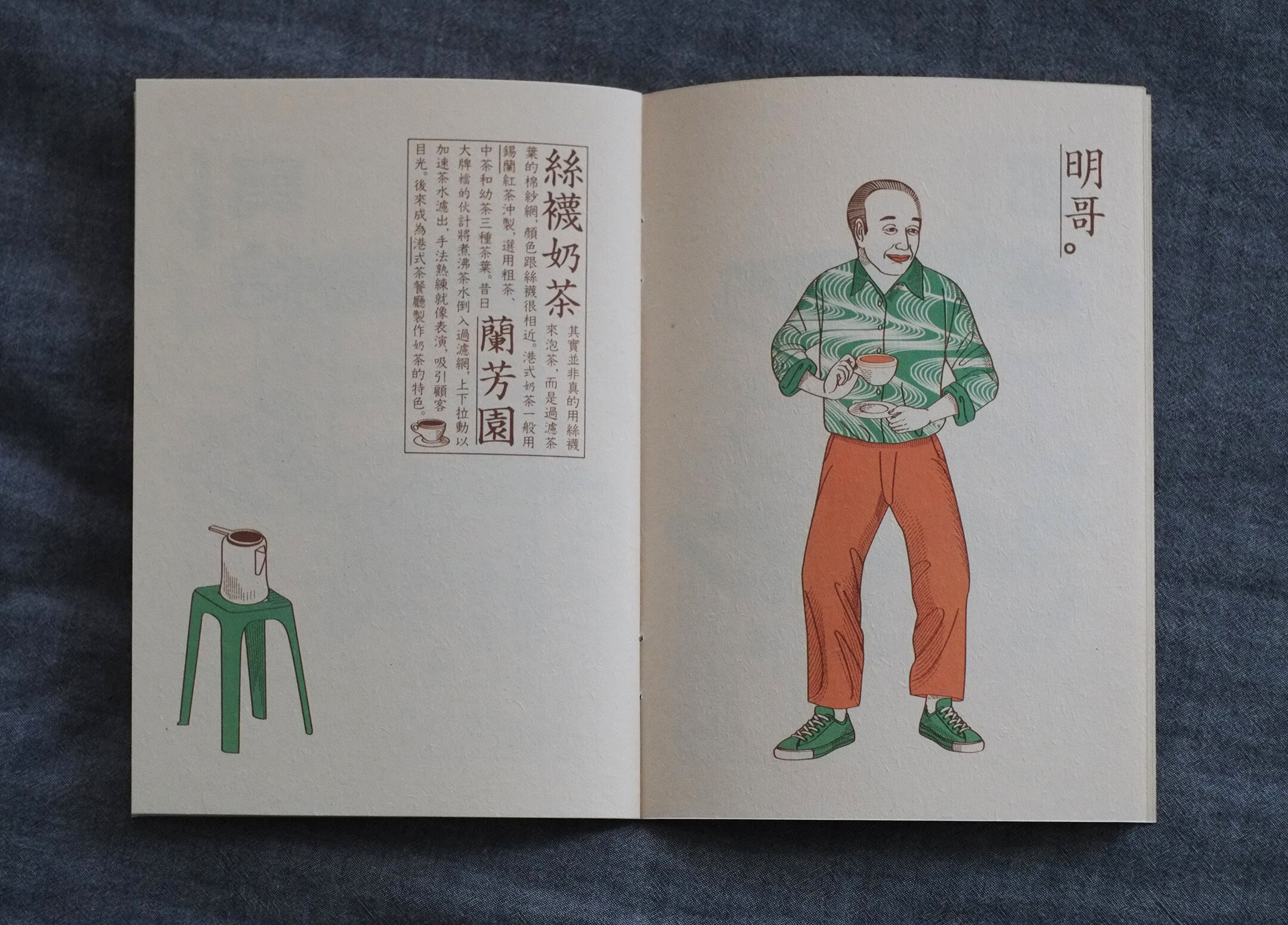
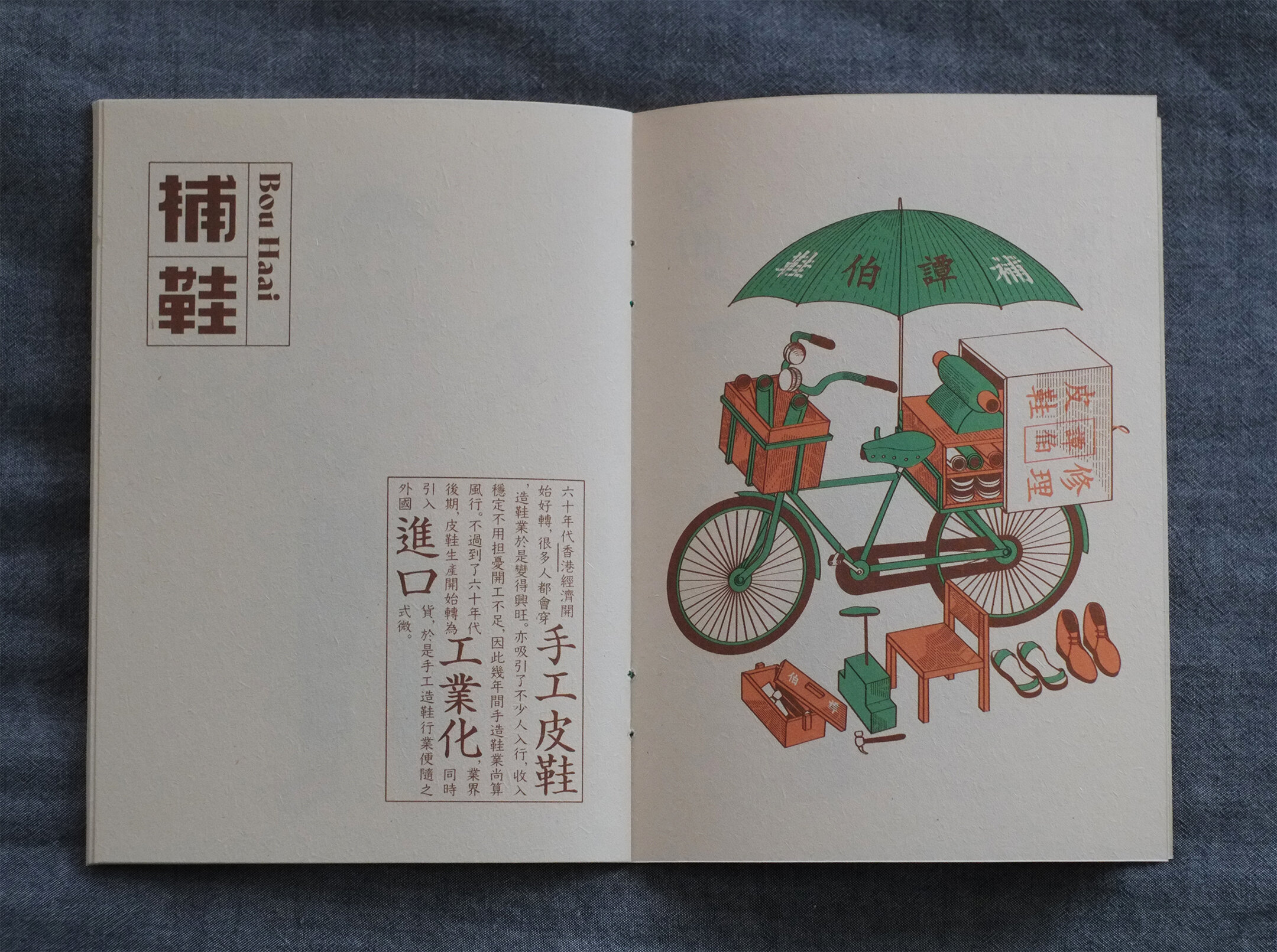
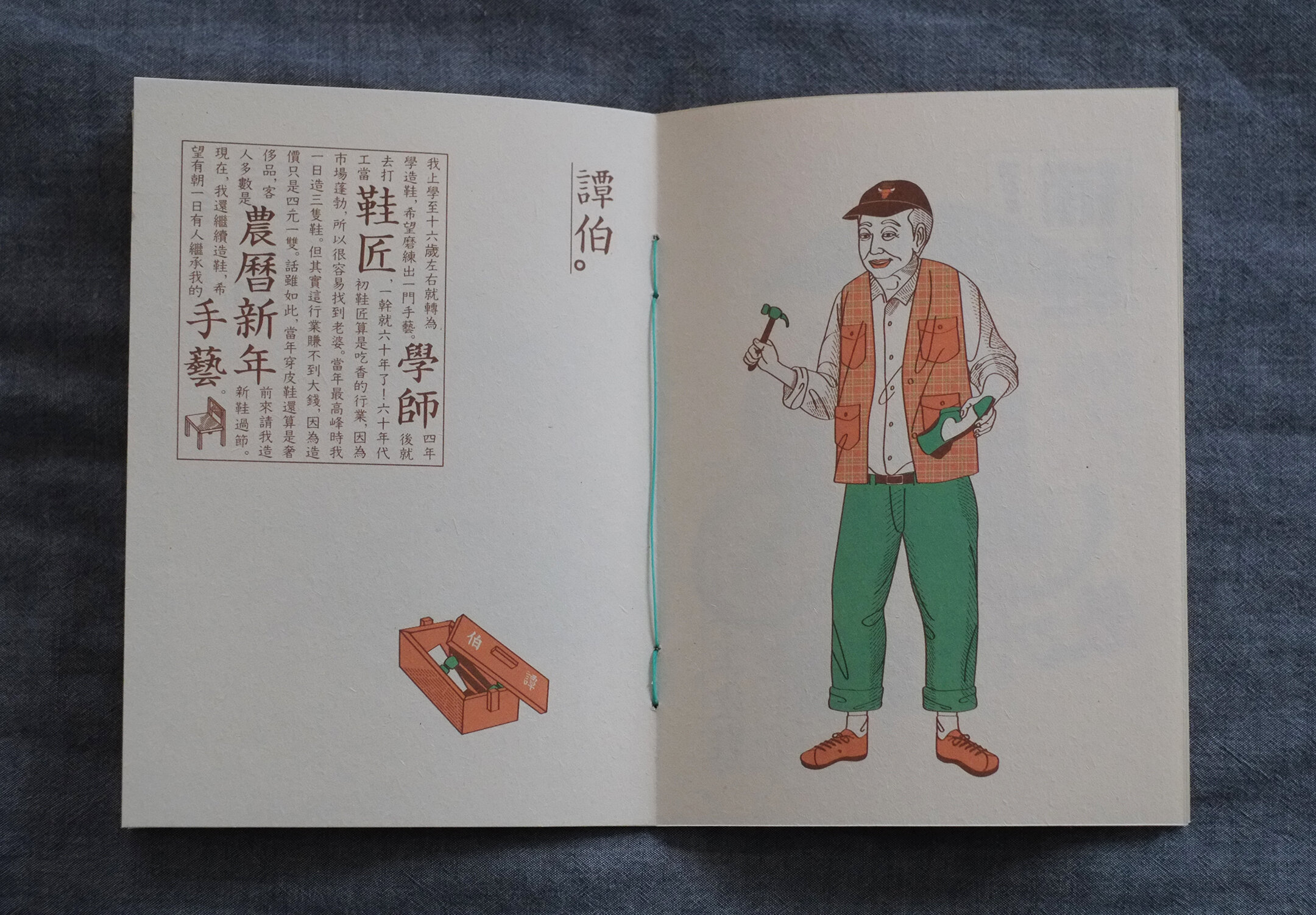
士多、西餐廳、算命、問卜、補鞋匠,讀上去,這些詞語總是帶著懷舊的感覺。不知不覺間,這些曾經的日常,都逐漸消失在街道和我們的記憶之中。
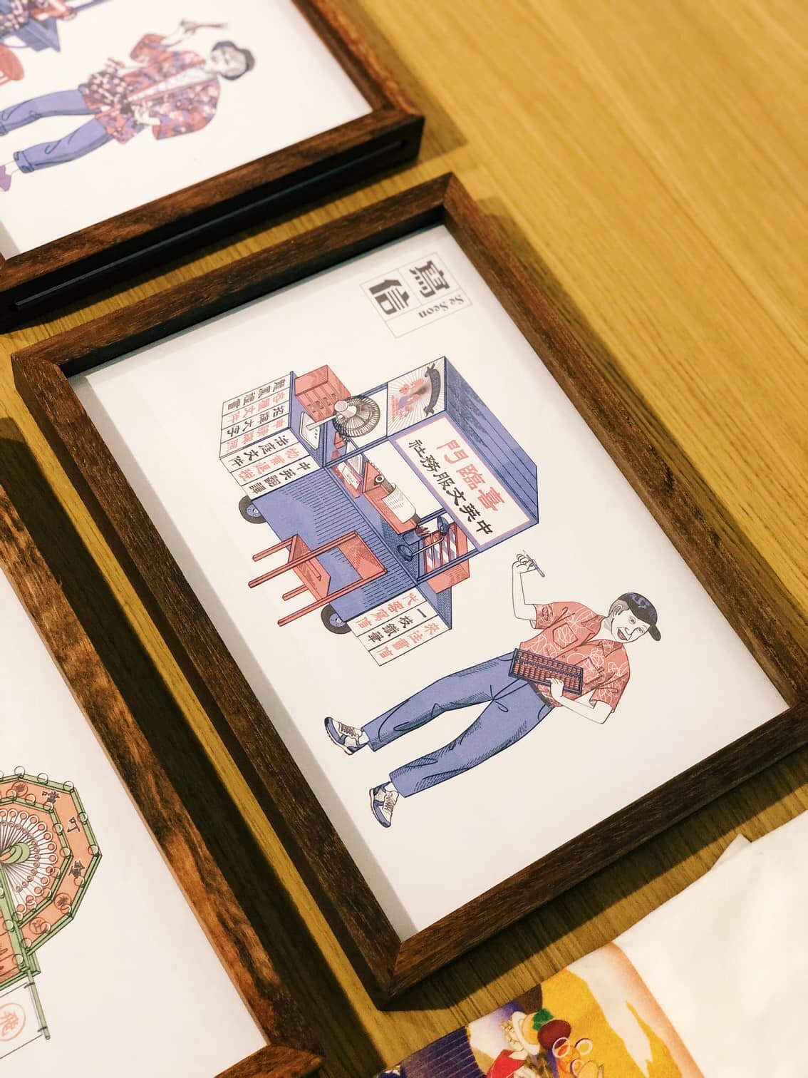
去年,設計師洪文寶(Po Hung)夥拍綠葉劇團,走訪了香港各大小老區,尋覓一些僅存的老職業和職人的故事,創作出「我哋大家在獅子山下相遇上」的流動劇場。
Po Hung由表演藝術,延伸至印藝。他與新世代的印刷職人合作,出版了海報、手工藝術書及名信片,把這些故事和人物轉化為插畫,以1950年代德國活版印刷和1980年代孔版印刷,重現香港本土故事。
-
Po Hung 說:香港,就是一塊「大笪地」。
什麼是大笪地呢?就是一塊「大空地」。是昔日遍佈港九的一種夜巿,亦被稱為「平民夜總會」,每個晚上,總是上演著便宜但撫慰人心的魔法。
如今,這塊大空地長滿了建築物。能觸動人的,卻愈來愈少。
藝術創作,或許,就是一場幻術,一場像龍貓一樣,在家園全毀前,重現鼎盛輝煌的幻術。在「像我這樣的一個港故佬」展覽當中,你可以沉浸在藝術家的幻術中。同時,亦參與「我地都係講故佬」活動,在明信片上,寫下你的故事,寄給另一個陌生人。
______________________________________________
「像我這樣的一個港故佬」洪文寶插畫展
展期|2/10/2020-31/10/2020
時間|12-7pm
地點|Book B 荃灣白田壩街45號南豐紗廠111號舖
______________________________________________
⚑ Website https://po-hung.squarespace.com/
⚑ Instagram https://www.instagram.com/po_hung/
⚑ Facebook https://www.facebook.com/pohungdesign
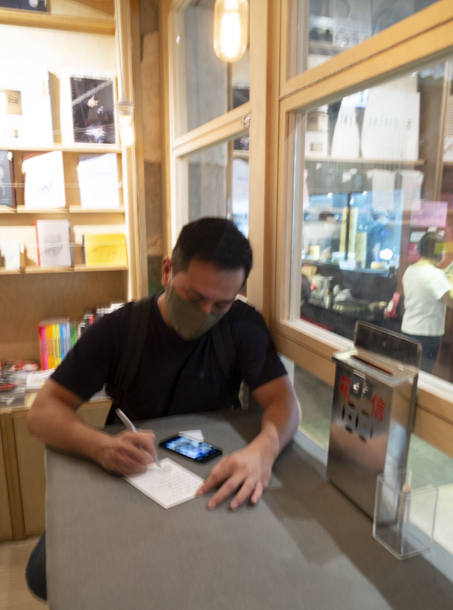
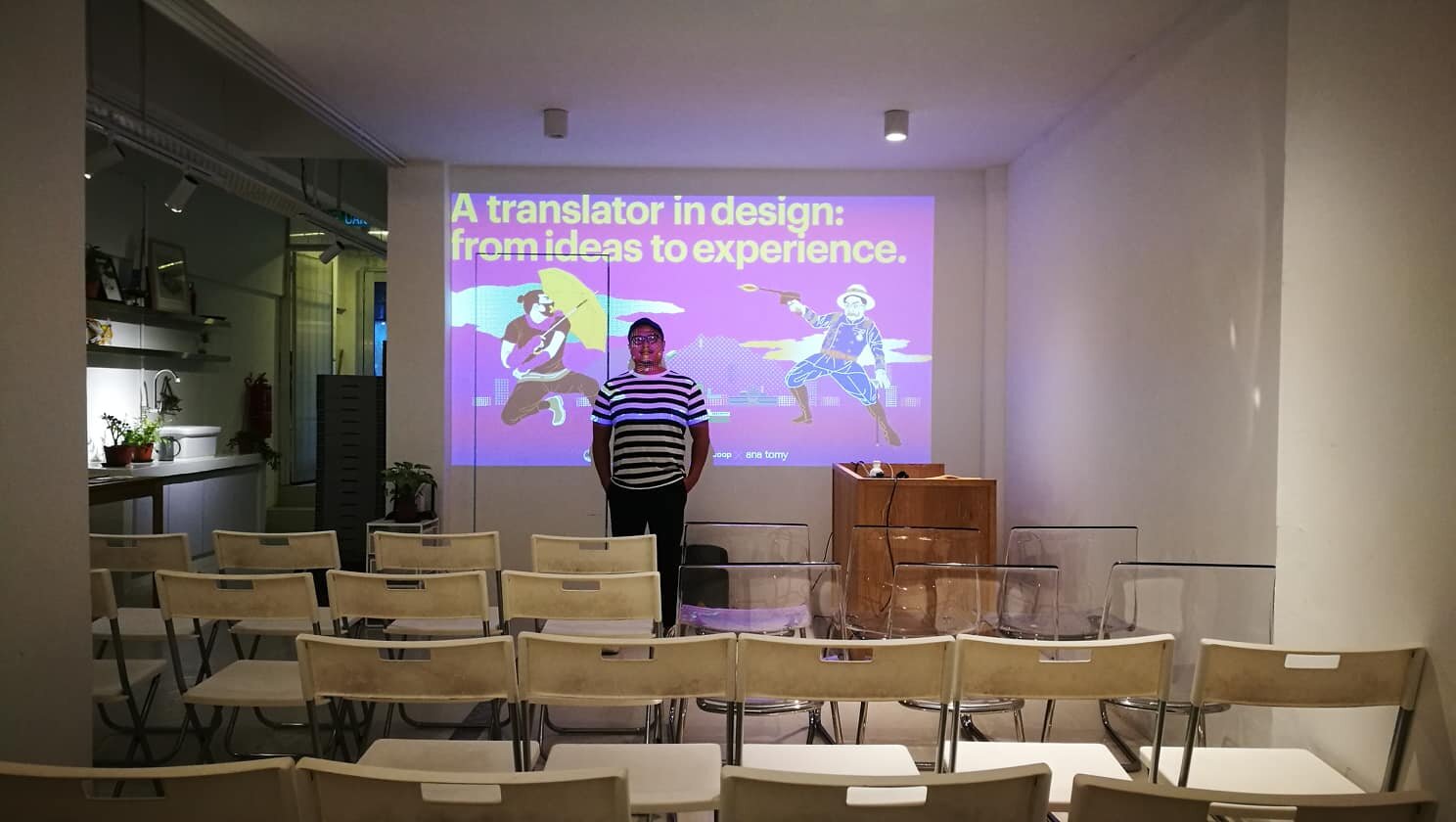
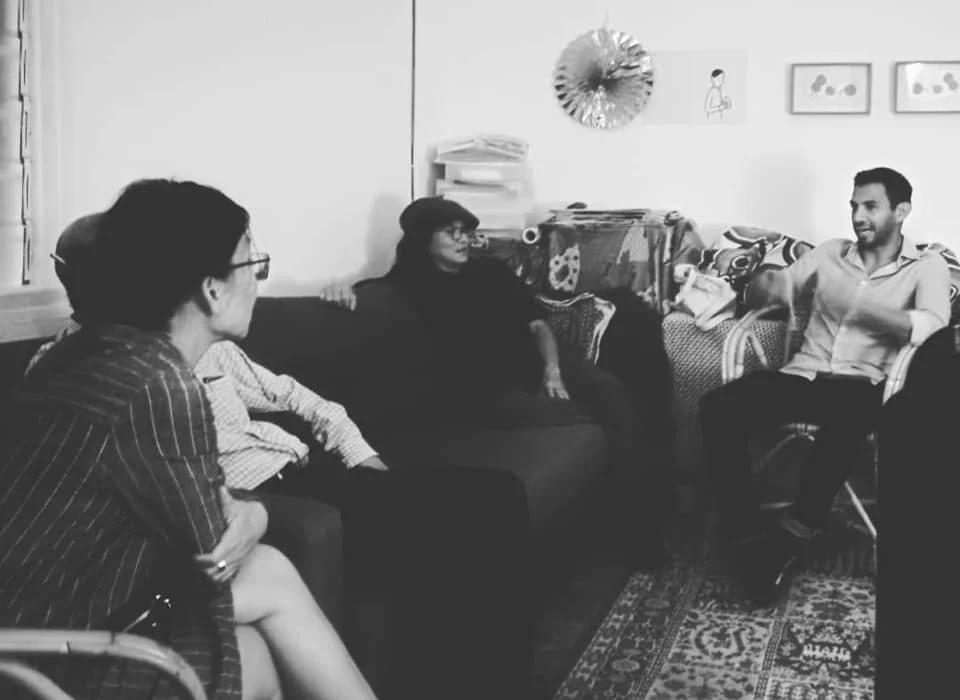
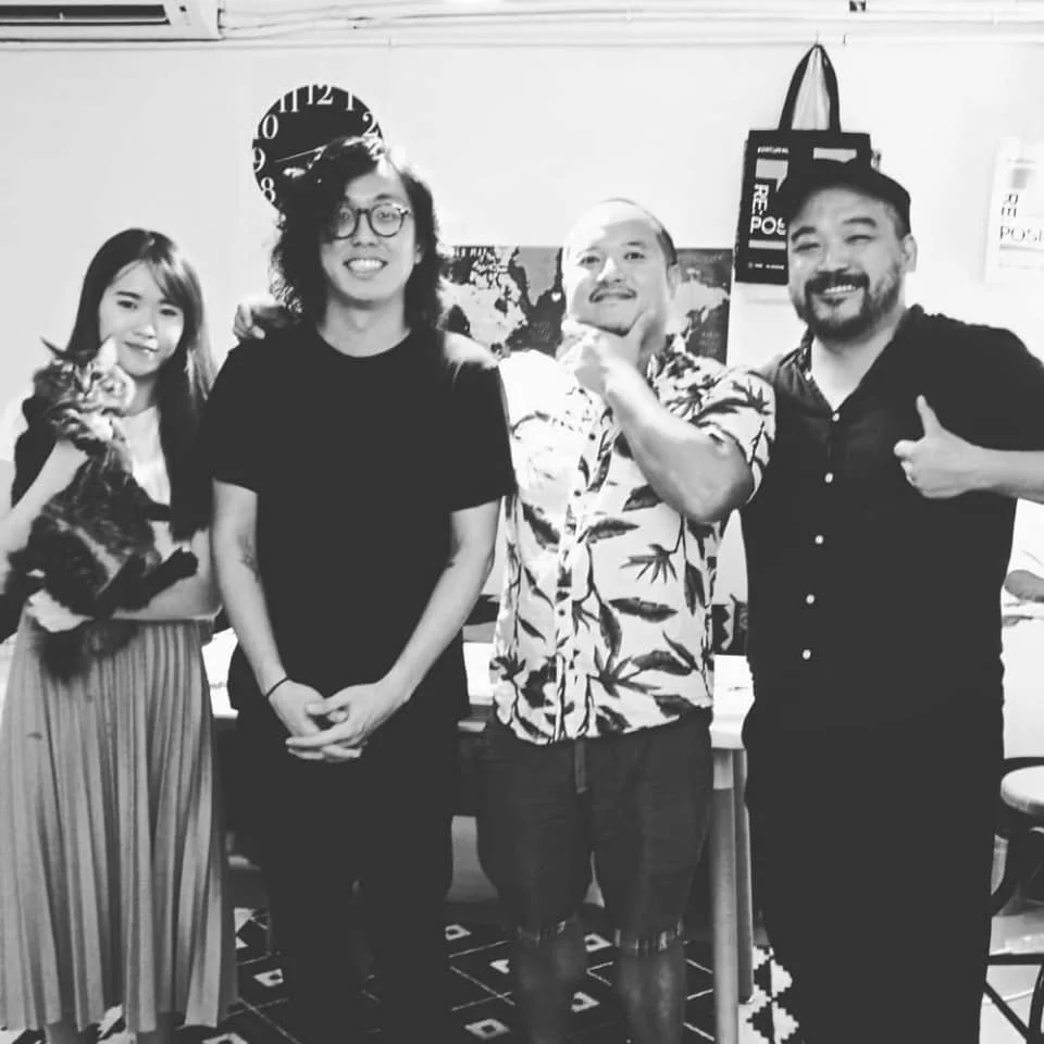
A translator in design: from ideas to experience
Shared my projects in graphic design, branding and arts in kuala lumpur, Malaysia. It’s very successful! Specially thanks to Kian Lian from Putticoop and Zee Jay from ana tomy.
Date: 9 Jan (Thursday)
Time: 8pm - 10pm
Venue: ana tomy
80G, Jalan Rotan
Free Admission
Conduct in Cantonese/English

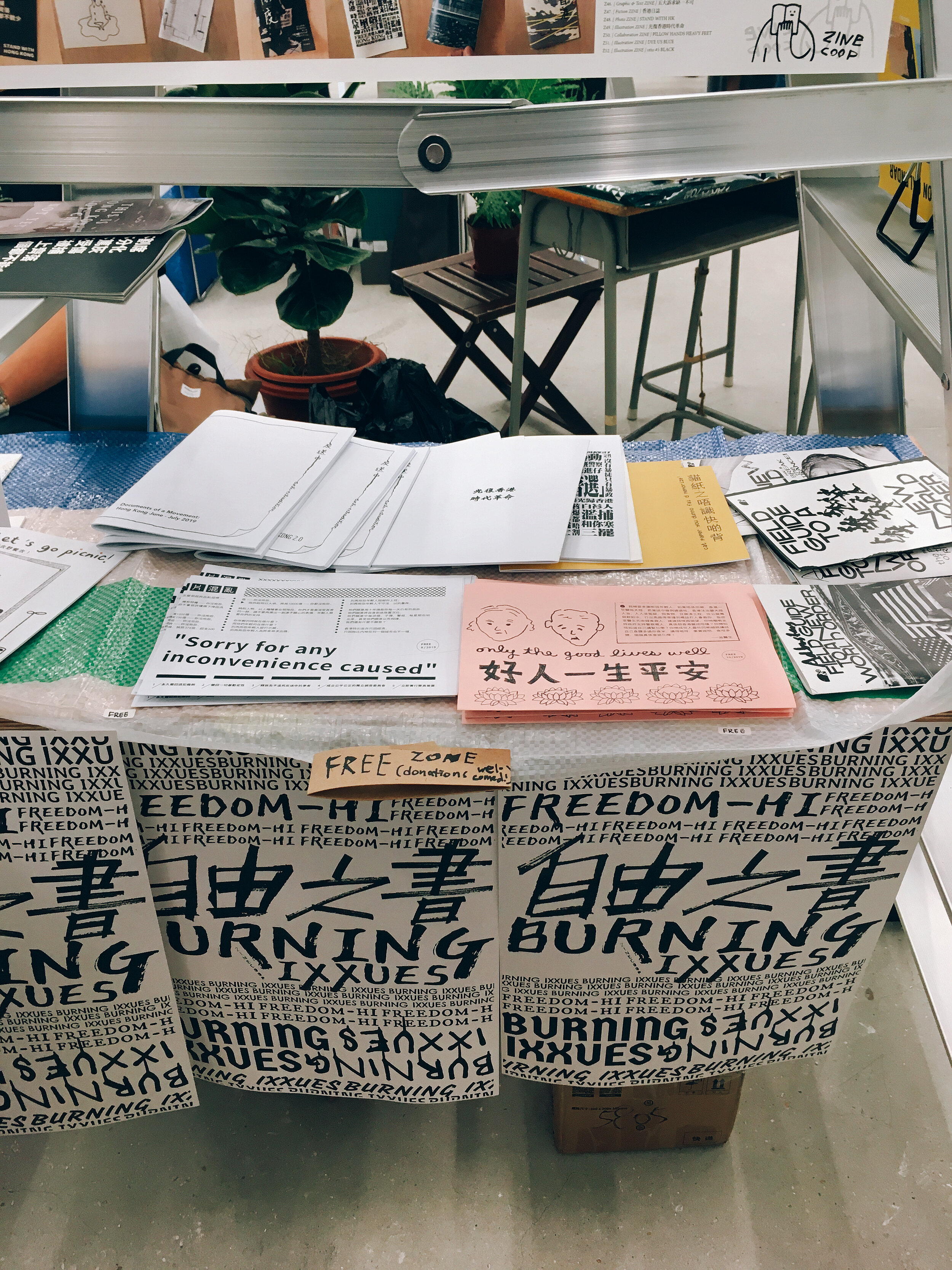
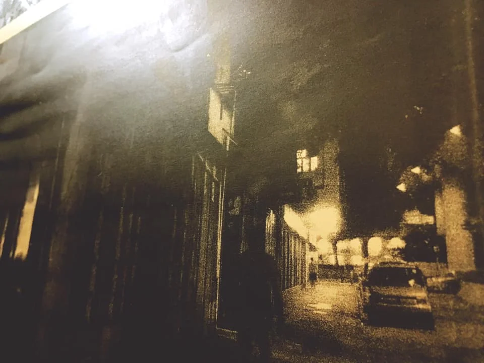
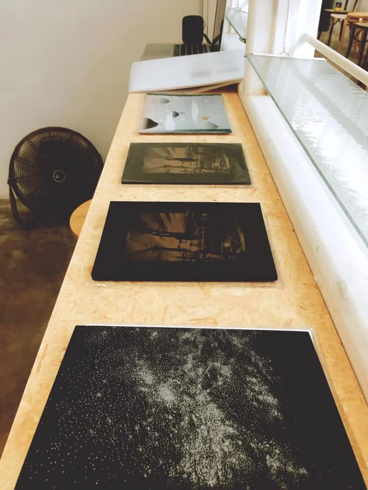
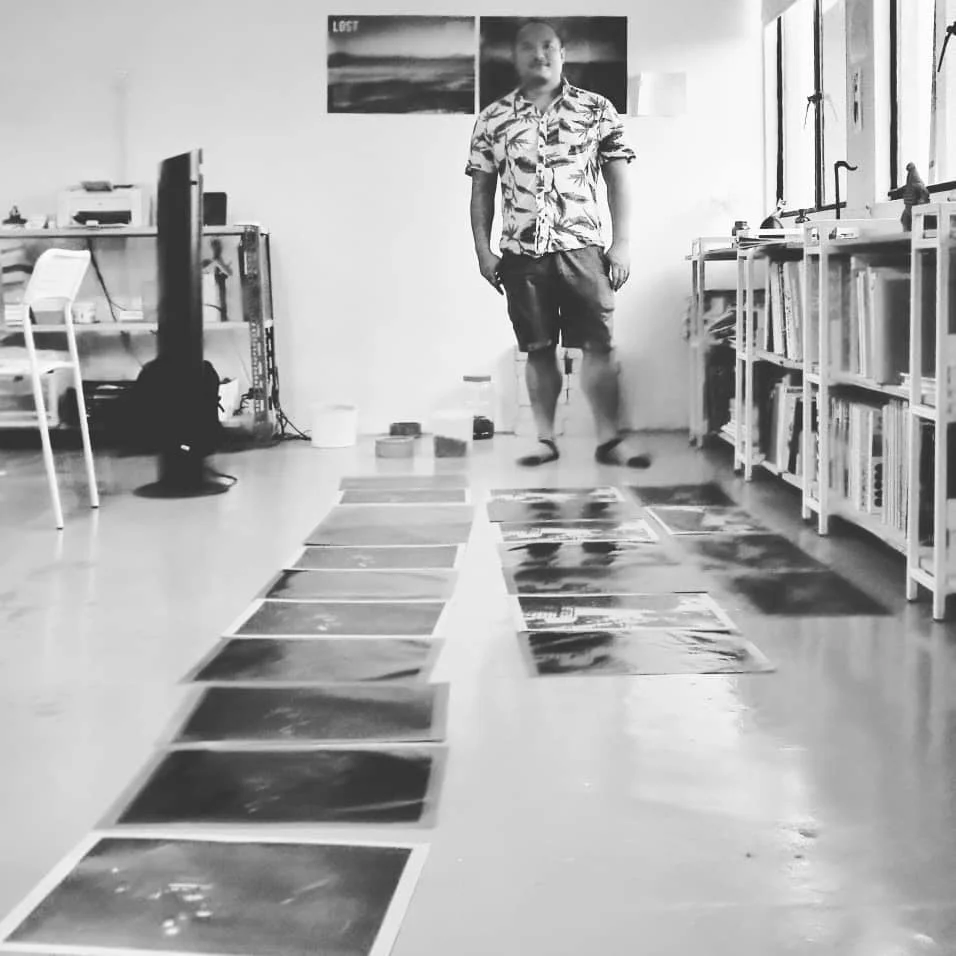
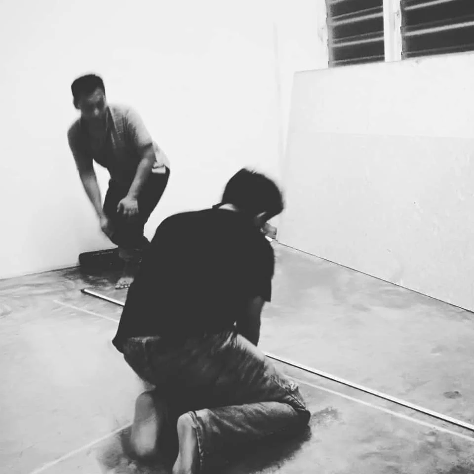
Printing process of Hong Kong Story 港故
Risograph printing @ dotdotdot studio
Hong Kong story 港故 is available @ Tai kwun art book fair
My new book "Hong Kong Story 港故" (artbook fair edition) is available @ Tai Kwun artbook fair, please find it in dotdotdot studio booth if you are interested :)
Design, illustration and handmaking:
Po Hung / Po Hung Design Lab
Writing: Po Hung and Kian Lian / putticoop
In collaboration with「我哋大家在獅子山下相遇上」by theatre 綠葉劇團 Théâtre de la Feuille
Printed and made in Hong Kong


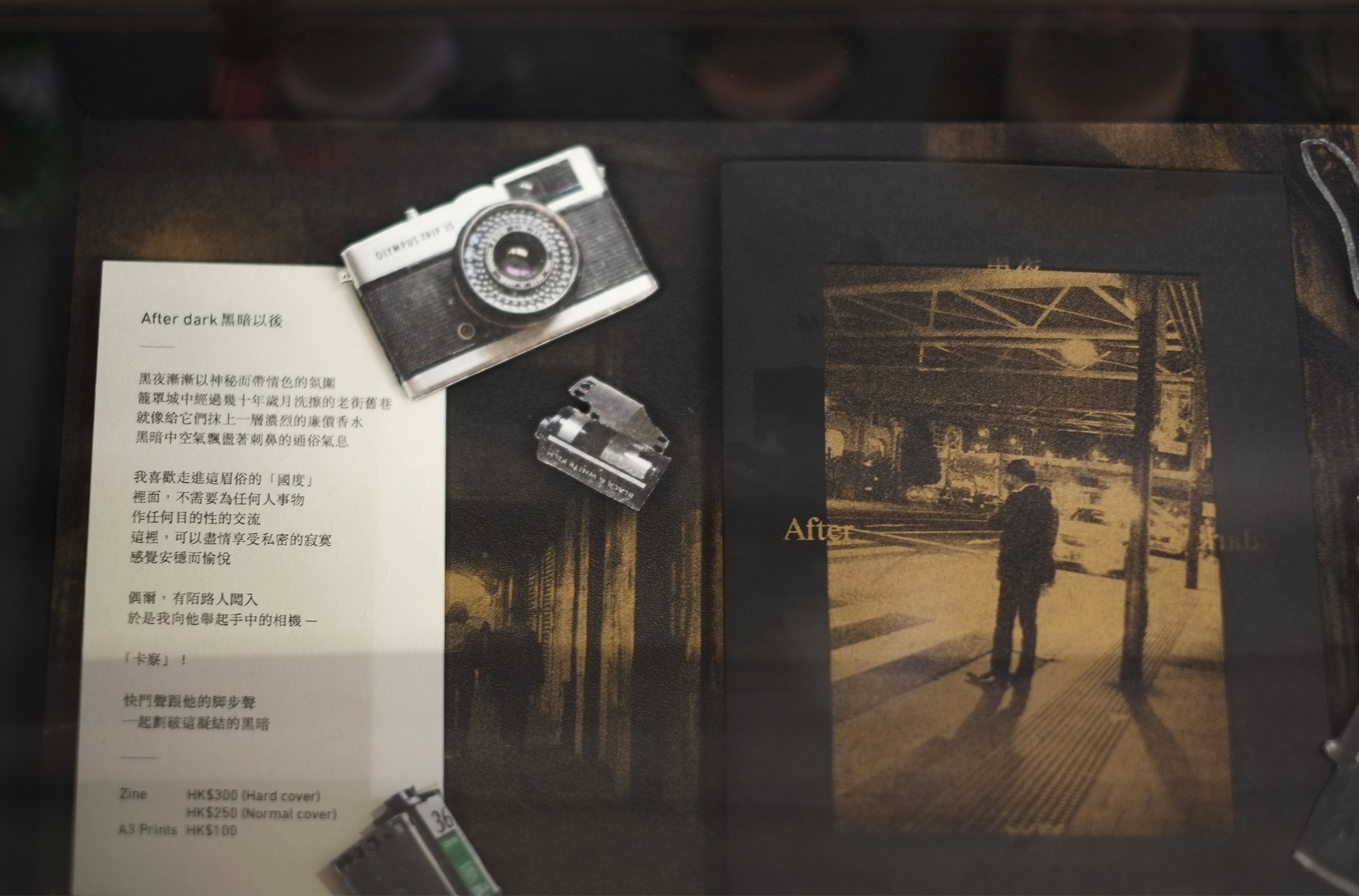
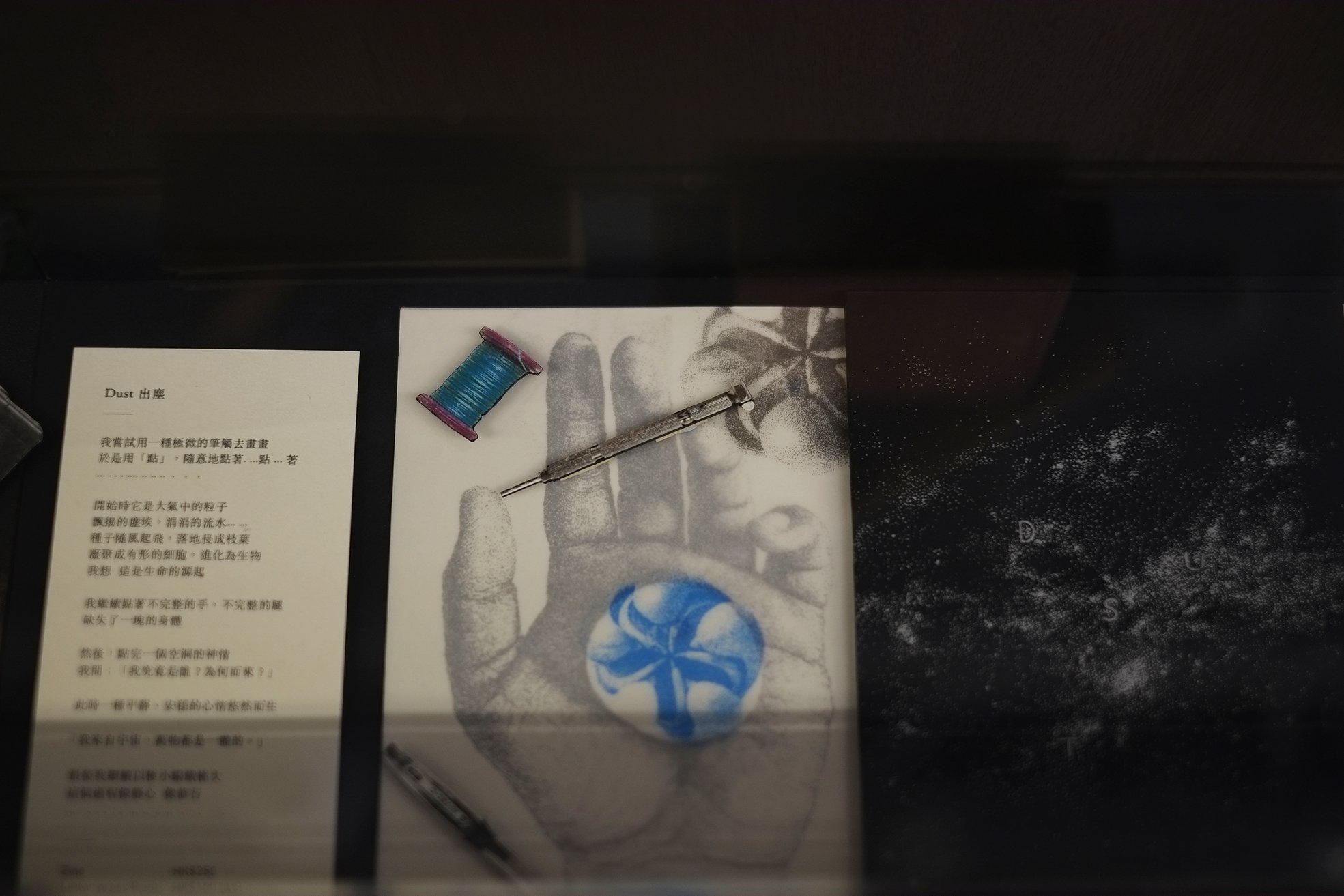
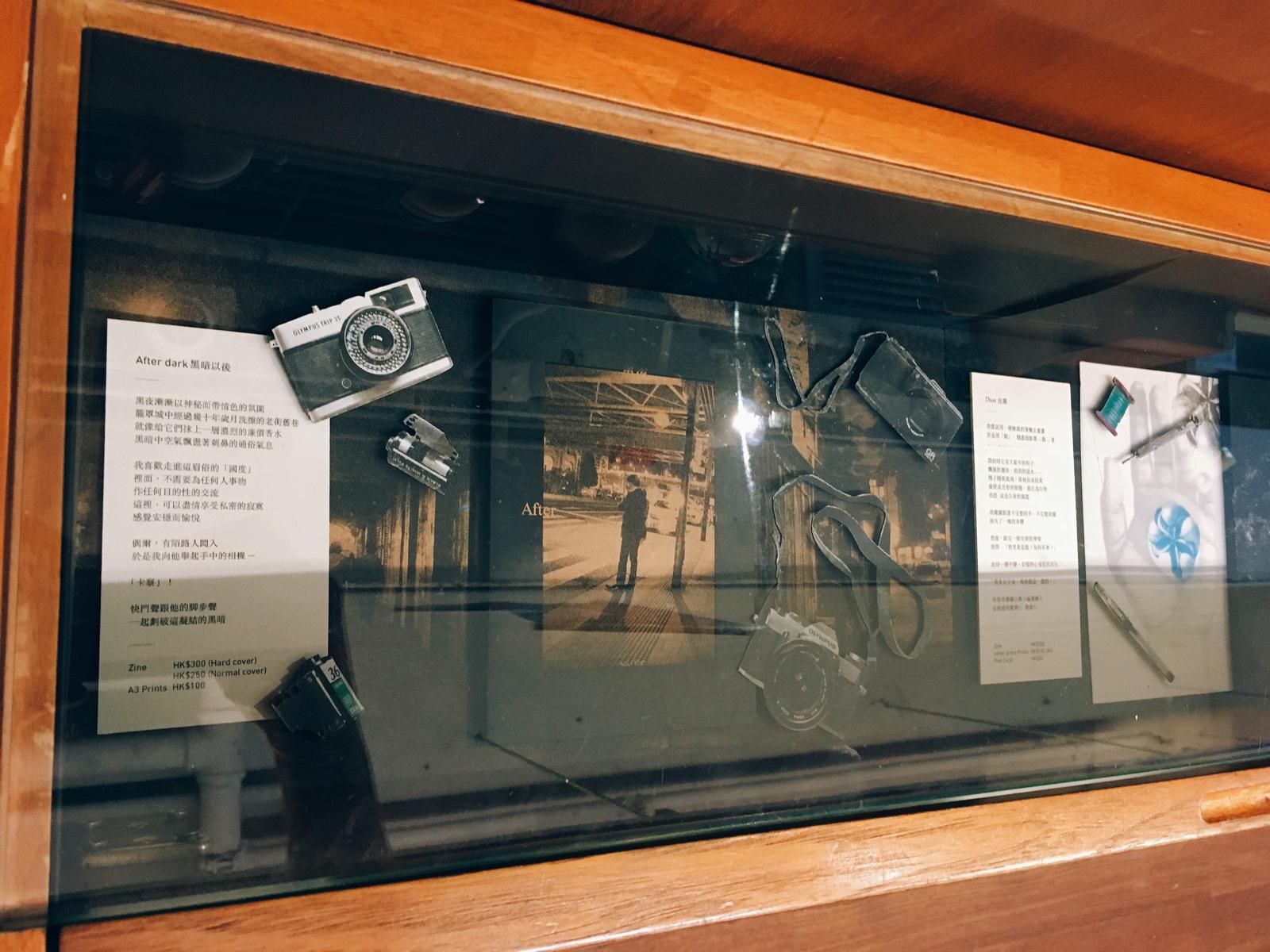
From dust to dark (March 2019)
出塵入夜 FROM DUST TO DARK A duo exhibition of 洪文寶 Hung Man Po (Hong Kong) 連建力 Lian Kian Lek (Malaysia) A collection of prints/photography/zine Presented by putticoop The Zhongshan Building 80C Jalan Rotan Kampung Attap 50460 Kuala Lumpur Exhibition until 26 May 2019 Opening hours 11am - 5pm (Sat/Sun) Otherwise by appointment +60182804683 Risograph printing by dotdotdot studio We Are Not Lie #FromDustToDark #putticoop #putticooperation #zhongshanbuilding #thezhongshanbuilding #KLexhibition #artinKL #podesign #hungmanpo #liankianlek #photography #risograph #risography #risographprinting #zine #zinester #zinefest #artzine #artbook #dotdotdothk #wearenotlie


Mobile Life / GAHA - designed by MUJI
https://youtu.be/L2PfxQr1jz8
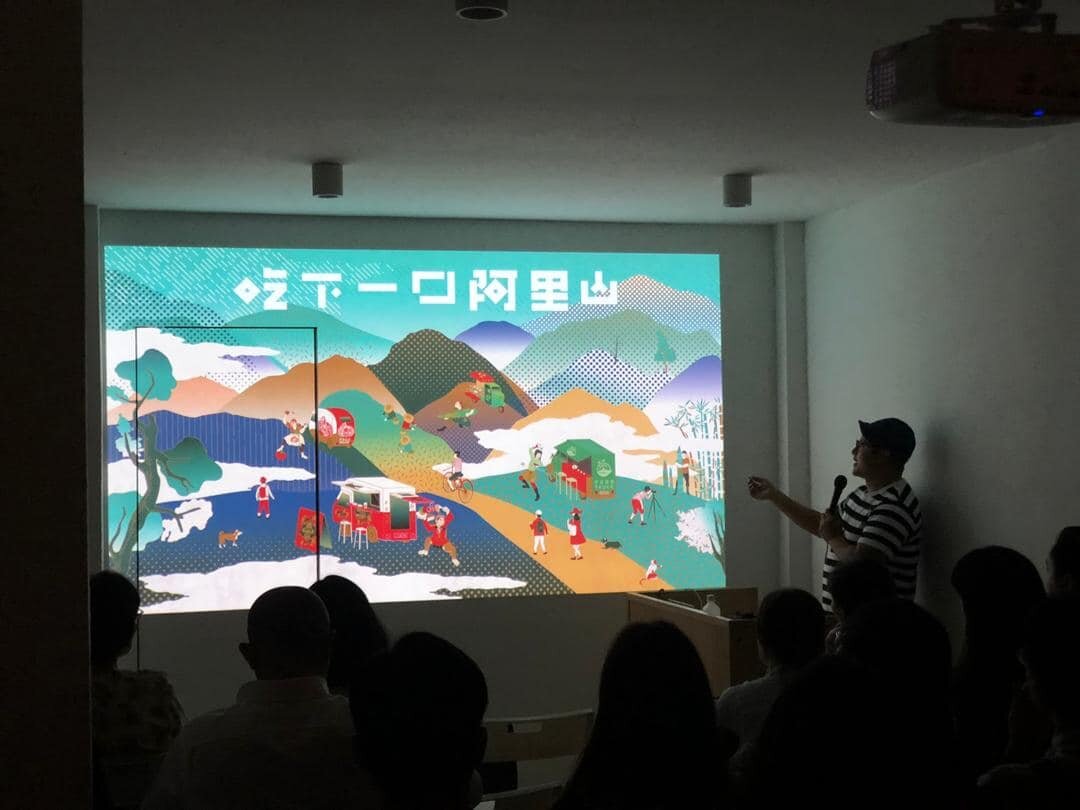
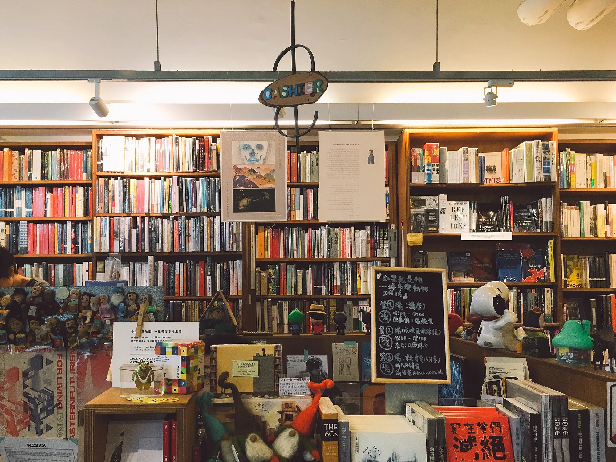
My 3 zines are available in Kubrick
My 3 zines: dust 出塵, after dark 黑夜以後 and Alishan 吃下一座阿里山 and some prints, are available in Kubrick (@hkkubrick2001/) , book b (@bookbhk), 藝鵠 (@artandcultureoutreach), Muse Art & Books (@hotelstage), dot dot dot (@dotdotdot.hk) (after dark only), Queer reads library 流動閱酷 (@queer_reads_library) (after dark only)


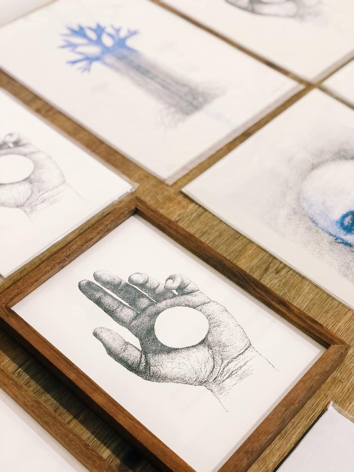
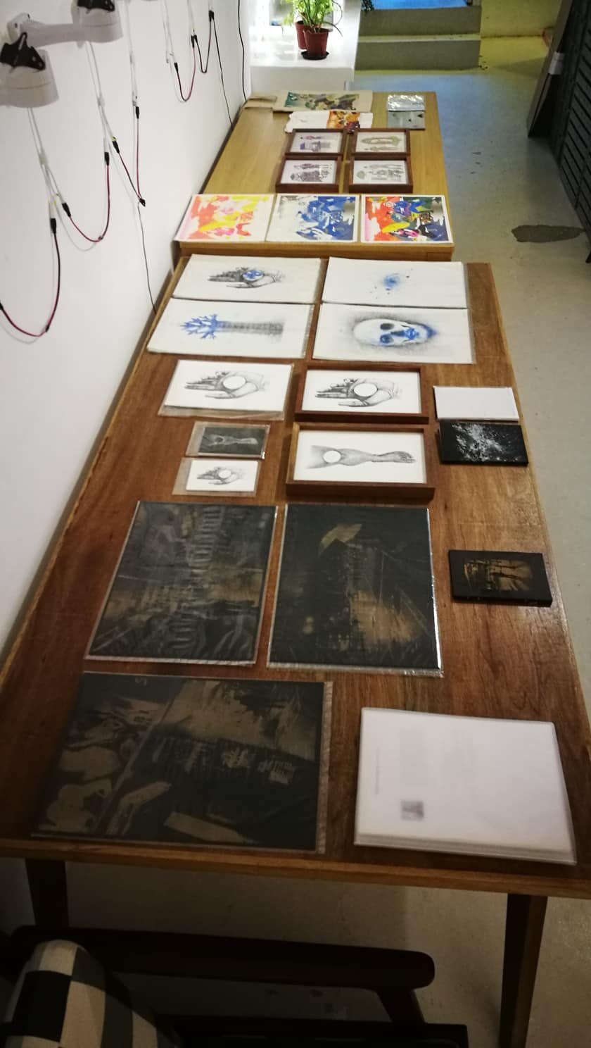
Limited letterpress printing for my pointillism artworks
Cooperated with The Alphabet Press (TAP) in Malaysia


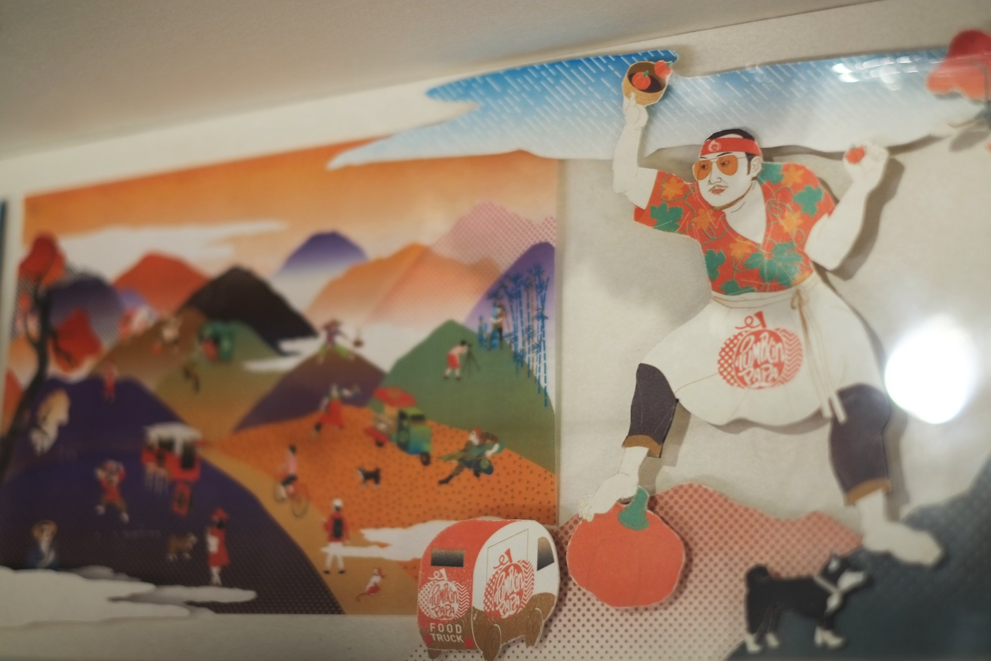
Design and illustration for Alishan Food Truck Gourmet Competition 2


Geniuses of Graphic 平面設計界的天才
Strongly recommend the May issue of pen magazine, the theme is "Geniuses of Graphic"
強力推薦五月號的pen雜誌,專題為「平面設計界的天才」


First, pen did an interview with Kenya Hara, Hara mentioned 3 points for how to do a successful graphic design.
首先pen邀請了原研哉去講解平面設計,原研哉提出三大創作成功的平面作品的基本重點。
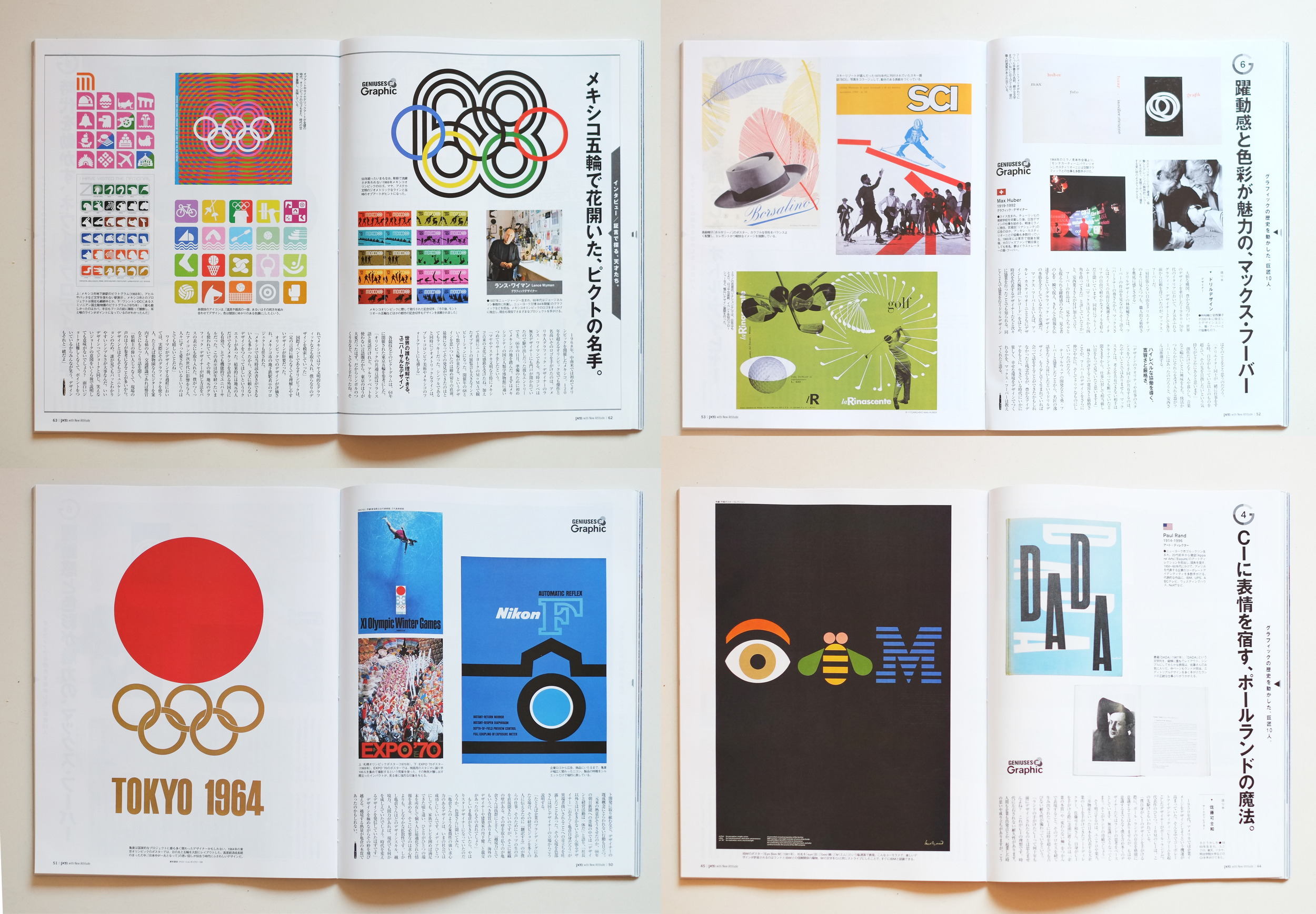
Cover story - Geniuses of Graphic
pen interviewed 10 famous Japanese designers, each designer introduced one genius graphic designer around the world, talked about why the genius be a legend.
封面專題 - 平面設計界的天才
pen訪問了10位日本最具名氣的設計師,每位設計師介紹一位當代天才設計師,講解這天才怎樣成為經典。

One of the hot topic of graphic design industry in Japan, is Ken Miki did a material for a creative course, through an simple element - apple, introduced 13 ways of creativity thinking.
近日在日本平面設計界的其中一個熱話,是名設計師三木健,透過一個簡單的元素-蘋果,提出13種方法去思考創作。


Pack Age and Cover design
包裝年代及封面設計
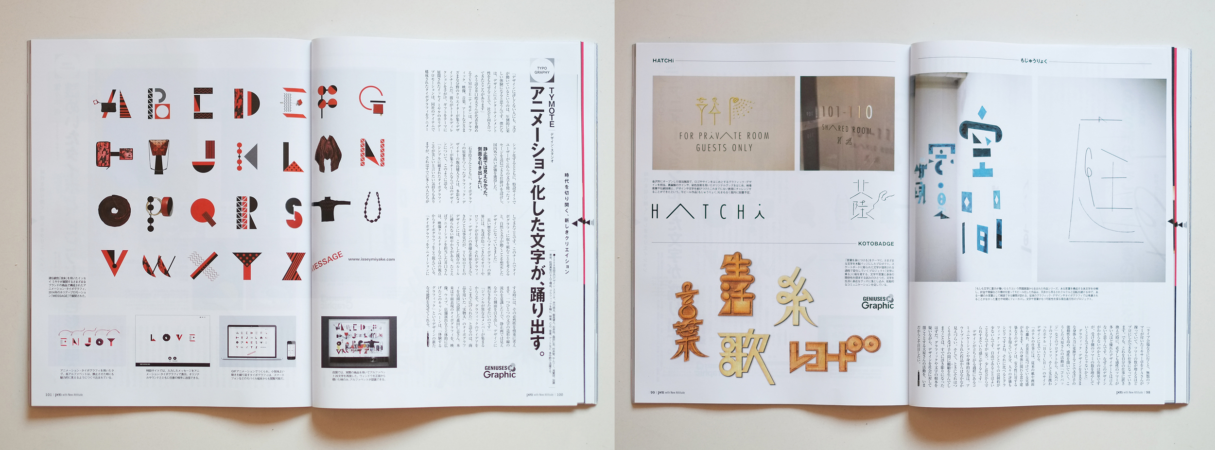
Typography
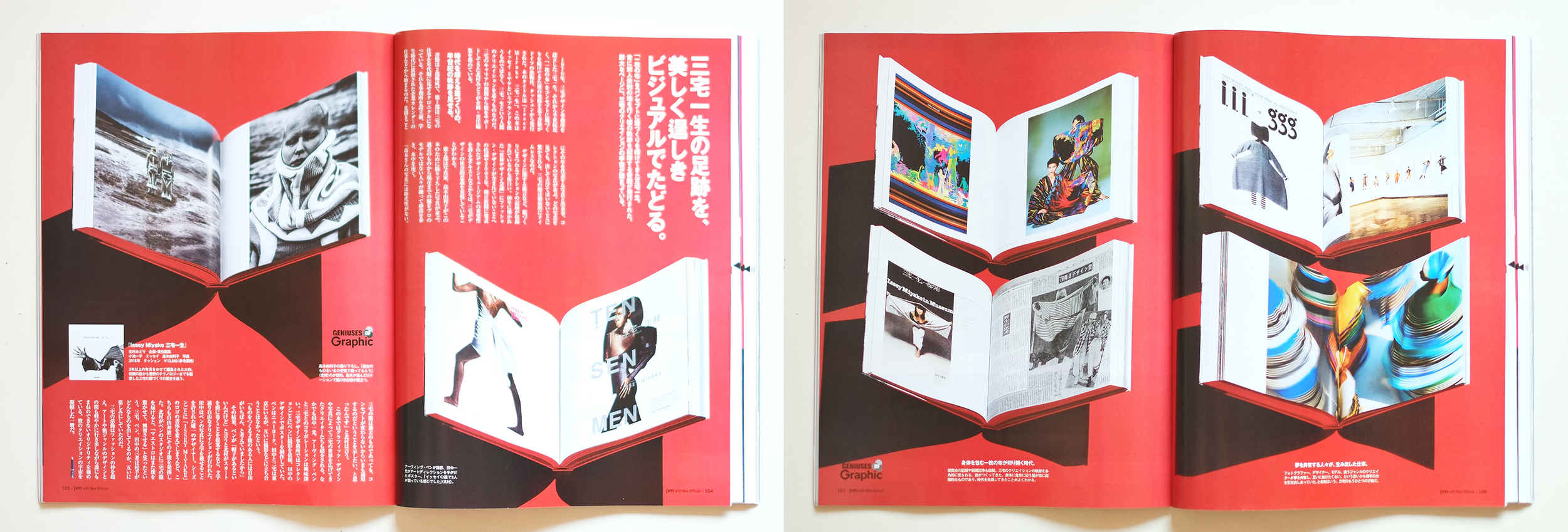
Issey Miyake

http://www.dezeen.com/2016/04/08/logo-designs-unveiled-tokyo-2020-olympics-graphics-news-japan/
Which will be the final Tokyo 2020 Olympics Brand? 哪個設計會是東京2020夏季奧運最終方案?
After the "copy cat" issue, Tokyo 2020 Olympics has announced 4 new sets of shortlisted emblem design and going to collect the comment from the community.
"We have implemented a series of format and design checks on all entries, and have received the cooperation of design experts during the design checks," said a statement from the Tokyo 2020 Emblems Selection Committee.
"We have received written pledges from each of the designers of the shortlisted designs specifying that they are the original creators," it continued. "They have also submitted documents demonstrating the design production process used for their creations."
"The creators of each of the shortlisted designs have poured their hearts and souls into their designs, and we would like to ask you to provide us with your positive views on the designs, and particularly those design aspects that you feel are truly outstanding," said committee members.
I feel that it's very hard to pick a set of logo I like in term of just look for the logo design but not the whole brand system. At the same time, the look and feel of new shortlisted emblems are much more complicated if compare with the last round, which I don't really prefer. Obviously, the emblems selection committee want to avoid the "copy cat" issue this time. But sorry that 4 options are not my cup of tea, and I am curious that how the brand system look of the 4 options?

http://www.ndc.co.jp/hara/en/olympic2020.html
Personally. I prefer the option which Kenya Hara did from first round submission. I understand that it's not the mainstream design - not colourful, not very festive and not very energetic. But it's really a unique and break through design. The meaning is more deep and subtle, look and feel is simple but memorable, which is close to the Japanese spiritual. I feel very pity about the committee didn't choose this when I see it every time.
經過一輪「複製貓」風雨後,東京2020年奧運會最近公布了於第二輪公開競賽中入圍的最終四個會徽設計。
「我們為了保證能嚴格檢查所有的設計方案項目,這次特別與檢查專家合作」-東京2020年會徽評選委員會的聲明。
「我們要求每個標書都需要連同每位設計者提供書面保證,他們的設計都是原創的,」 「而且每位參與者都需要提交創作設計生產流程的文件,以保證作品完全原創。」
「每個入圍設計的創作者都傾注他們的熱心和靈魂去設計,我們想請您一起參與,為我們提供積極的意見,那些設計方案對您來說是真正優秀的設計,」-該委員會的成員。
不過,單只看標誌而不是整體品牌視覺系統而去決定一個方案,對我來說是非常困難的。同時,比較上一輪的入圍設計,我並不特別喜歡新入圍的方案,原因之一是四套標誌都較為複雜。顯然地,標誌評選委員會這次希望完全避免「複製貓」的重演,所以意向都比較明顯的選擇更「獨特」的「原創」設計。但遺憾是,四個候選方案我都不是特別喜歡,而我還是好奇它們的視覺系統會怎樣去表現?
個人而言,我更喜歡在第一輪的方案中由原研哉設計的一套方案。我知道,這並不是一個主流喜歡的設計-它沒有豐富的色彩,沒有歡快的氣氛和動感。但這是一套獨特創新的設計,是一個突破性的設計。它的意念是深層而含蓄的,觀感又非常簡潔但令人一見難忘,系統又非常完整,這非常接近日本的傳統精神,這精神為什麼不可以是世界性的?每次看到這套設計,我都不期然替原研哉感到可惜...